As part of my internship in the company, I was tasked with coming up with ideas to improve the app. To showcase visually the extent of the changes I had in mind, I decided to undertake redesigning the entire app. The focus of my redesign involved making the app user-friendly and fun while increasing user engagement in social features. I built a comprehensive and flexible design system in Figma

Magzter is a worldwide digital magazine newsstand with over 8,000 publications from 3,400+ publishers in 40+ categories and 60+ languages. Magzter is accessible as an app as well as a website for browser-based reading. The Magzter app is primarily a magazine and newspaper reader app, with features like Stories (textual form of news articles) and a social media feature called Connect, which allows users to clip parts of a publication and share it.
One of the key elements that made me consider redesigning the Magzter app was how the app was lacking in terms of its user interface. I feel that the app is quite outmoded. Though the app is fairly efficient, the design isn't fun. Following a thorough examination of the app, I set out to reimagine the Magzter app and improve the experience in any way I could.
Since I had already used the app and had some idea about it, I decided to do an in-depth analysis of the app first. I wanted to understand the functionalities, overall architecture, and navigation.
There is one main goal for all functions in the app, which is to make the user read a publication, either by buying a single issue, subscribing to a publication, or opting for Magzter Gold subcription, which gives access to all the content on the app for the subscribed period.
I found 5 priority flows through which it is done:
.png)
Studying the overall layout of the app gave me a clear picture of the grouping of features. I immediately noticed some features could be placed elsewhere in the IA. I was able to identify some usability issues and pain points.
.png)
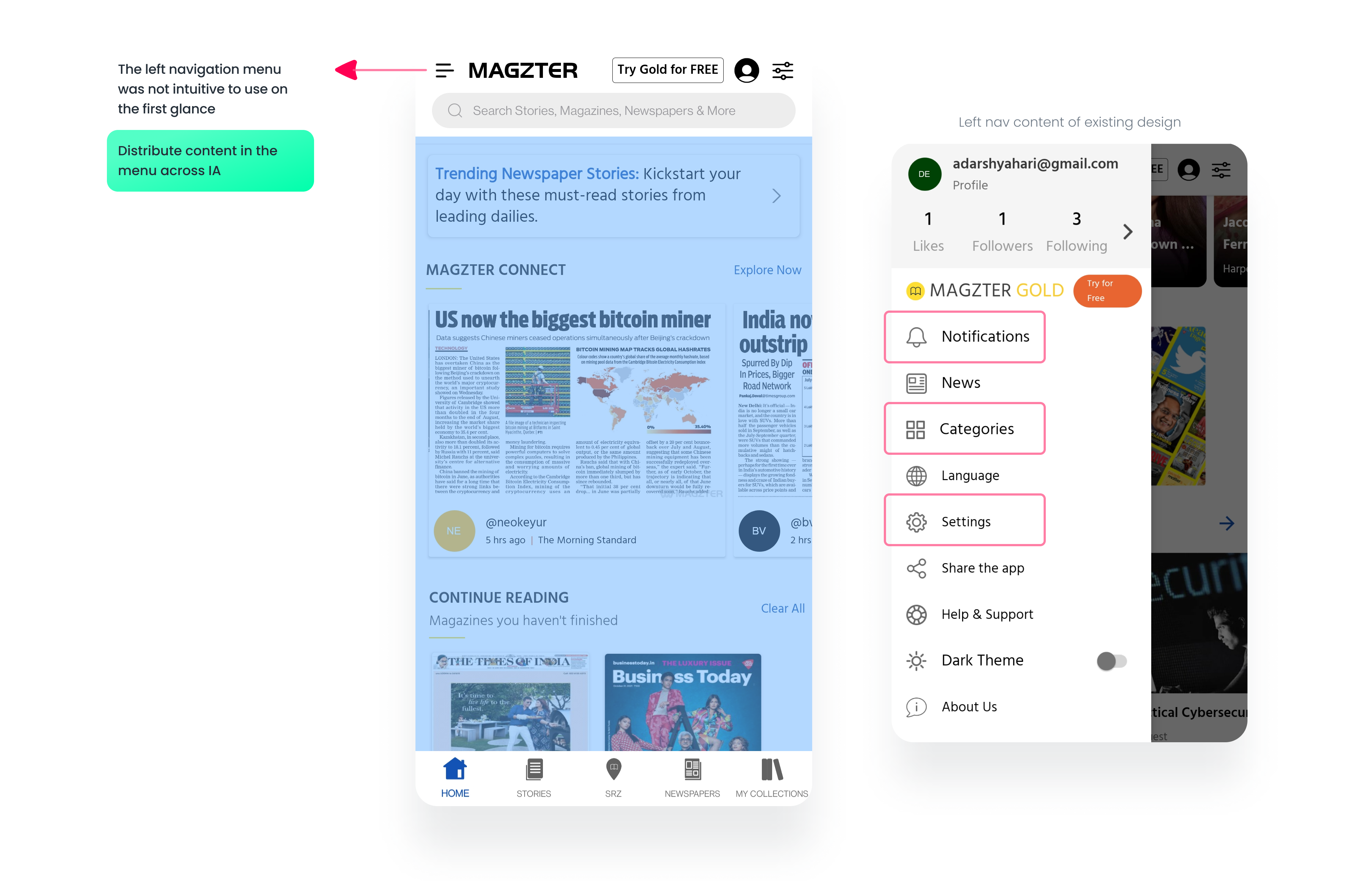
The current app has an out-of-date, crowded top app bar. There was also no branding, which I felt could help ground users to the app. The left navigation menu was redundant, as all the items on the menu could've been better placed elsewhere in the IA. To put this to the test, I ran affinity mapping test.
📐 I made sure that the number of taps taken to reach a destination were lesser or equal to what they were before, during the redesign.
The notifications, categories, and settings are key features that could be placed right in the homepage with more emphasis. All the other options find a better place in the Settings page of the app, which can easily be accessed from the homepage.
To give the homepage a personalised sense and make the users feel welcome, I included a small greeting at the top, along with the user's name. The search bar is now an icon on the top app bar, along with the settings and notifications. I also included the Magzter logo and the brand name. Adding a dash of colour to the 'try Gold' button makes it more noticeable.
🧠 Increasing discoverability, increases user interaction with the feature.
Explore, Newspapers and Connect, are now persistently present at the top along with the top app bar. This gives the Connect feature a more grounded space in the Homepage than before.

📐 All the buttons have a lot of space around them, to make the design more accessible. The bottom navbar is also modified to include a color filled icon when active and outlined when inactive.
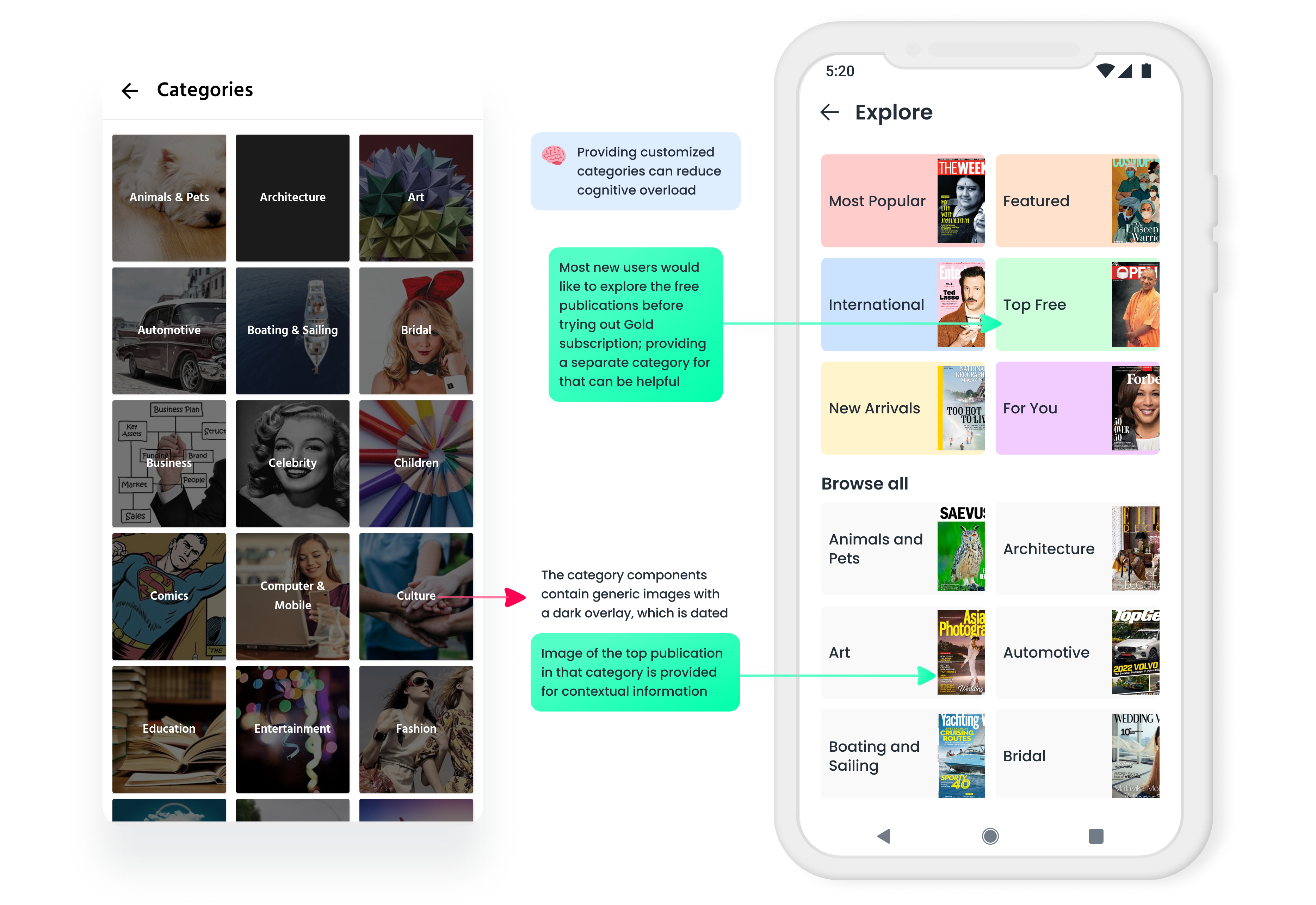
I rebranded 'Categories' as 'Explore' to give it a fresh feel. The category components now include an image of the top grossing magazine of that category, to give context to the user on what to expect. I also included five categories adapted from the Magzter website, which are displayed at the beginning, and a sixth category called 'For You' that I included. This would encompass all the recommended publications based on users interest and the previous publications user has read.
🧠 Cognitive load is the total amount of mental effort that is required to complete a task. By providing customized categories, we can reduce cognitive load.
The Smart Reading Zone, or SRZ, page was the third page I investigated. With this feature, users can visit SRZs and gain free access to Magzter Gold. These SRZs are all over the country, in cafes and libraries. This seemed like a really great feature that needed to be promoted to me. Users may get a lot out of it, especially if they want to test out Magzter Gold before subscribing. However, unless location is enabled, the present design consists of a static screen that explains what the function performs.

In my redesign, I directly offered users a map view of available SRZs, which would have been visible only with the location switched on in the previous interface. I also included a search bar and a list option that would display all of the accessible SRZs in the existing map view.
But, to view the nearest SRZ, access directions, or to be notified when nearing an SRZ, users would have to turn location services on. Thereby, I show users the benefit of turning on location services and leave it up to them to decide whether or not to do so.
🧠 Users are more likely to interact with prompts they setup for themselves. This self-initiated trigger comes in the form of the 'Find Nearest SRZ' button, which when clicked, prompts user to turn on location.
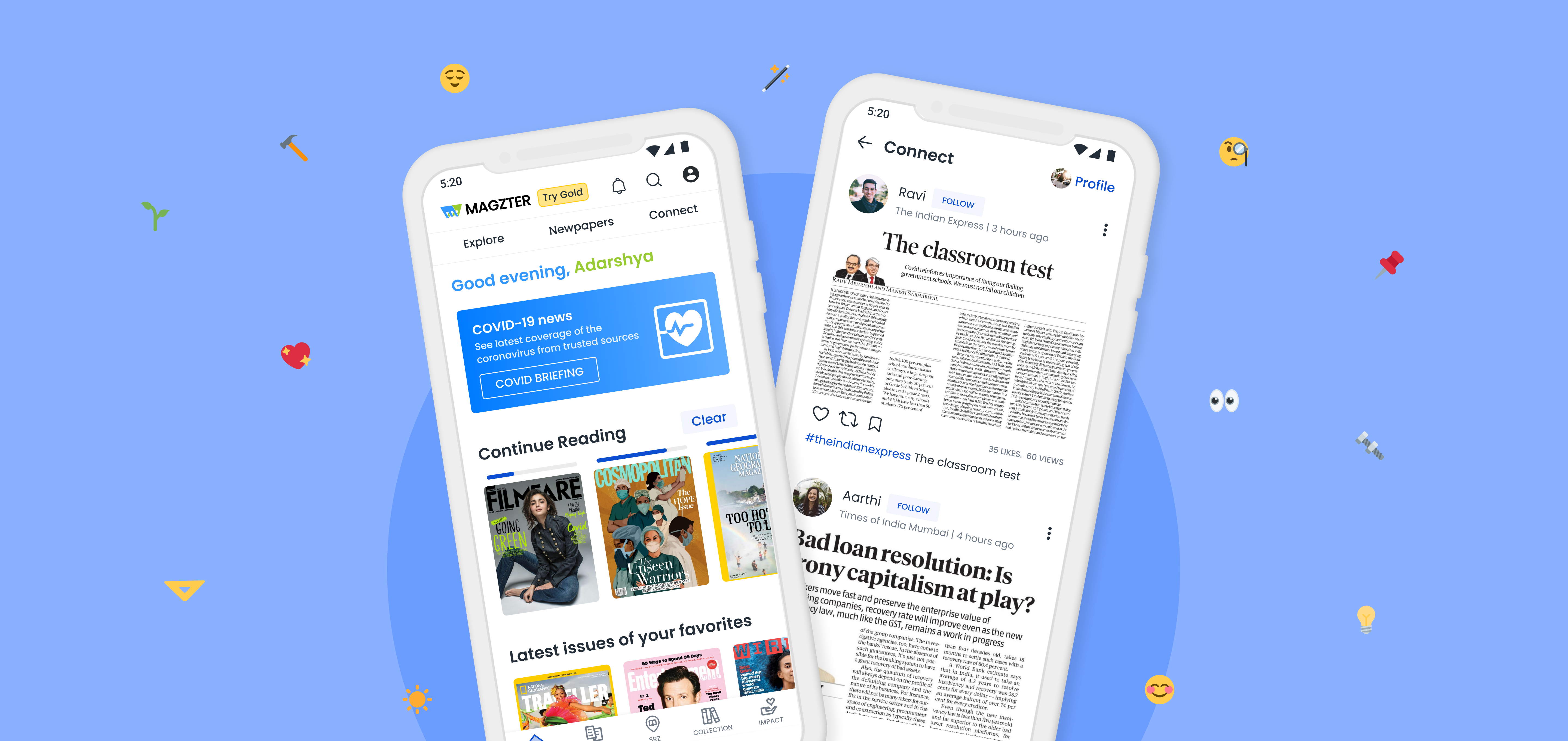
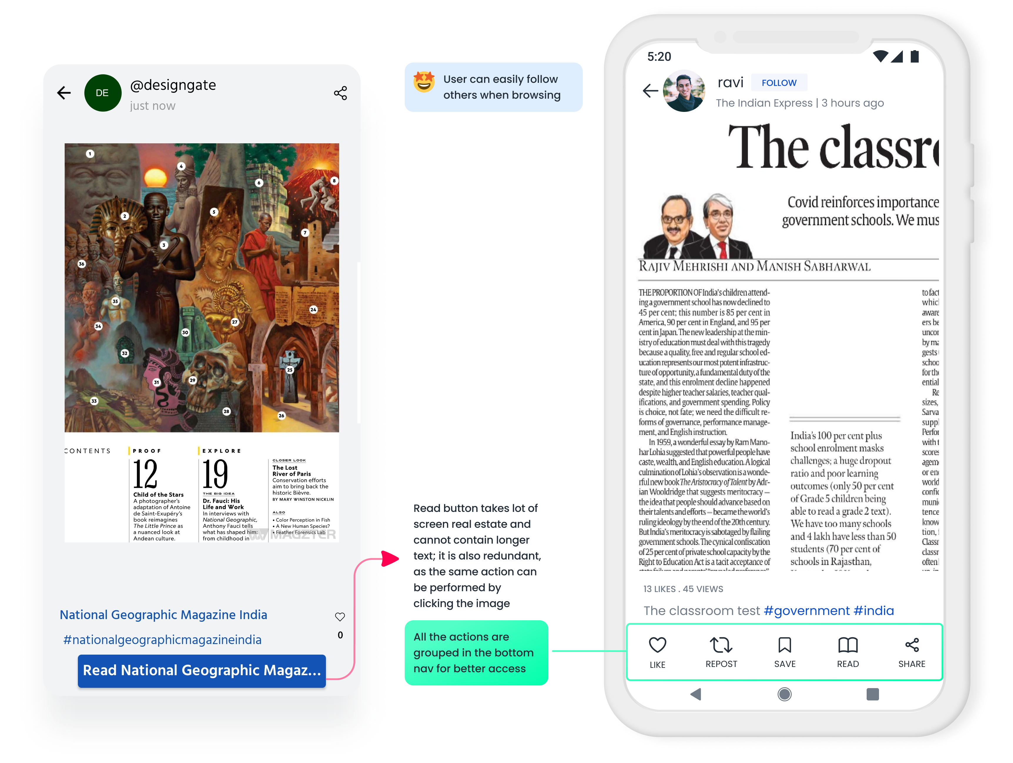
I had a lot of ideas for the Connect feature, which took up a large portion of my redesign. The major goal of the makeover was to revamp the core Connect page components. The current layout consists of two columns. Each post component had the username (of the user who posted), the time it was posted, and a like button with a like count, as well as images that were fit-to-width. This design didn't appear to work for a content-based social media feed. Furthermore, having two tabs with stuff to peruse made no sense.
💡 Hashtags are used in Magzter Connect by the users to tag their clippings with appropriate tags and description. But most users do not add a custom description or hashtags and not many people follow hashtags actively.
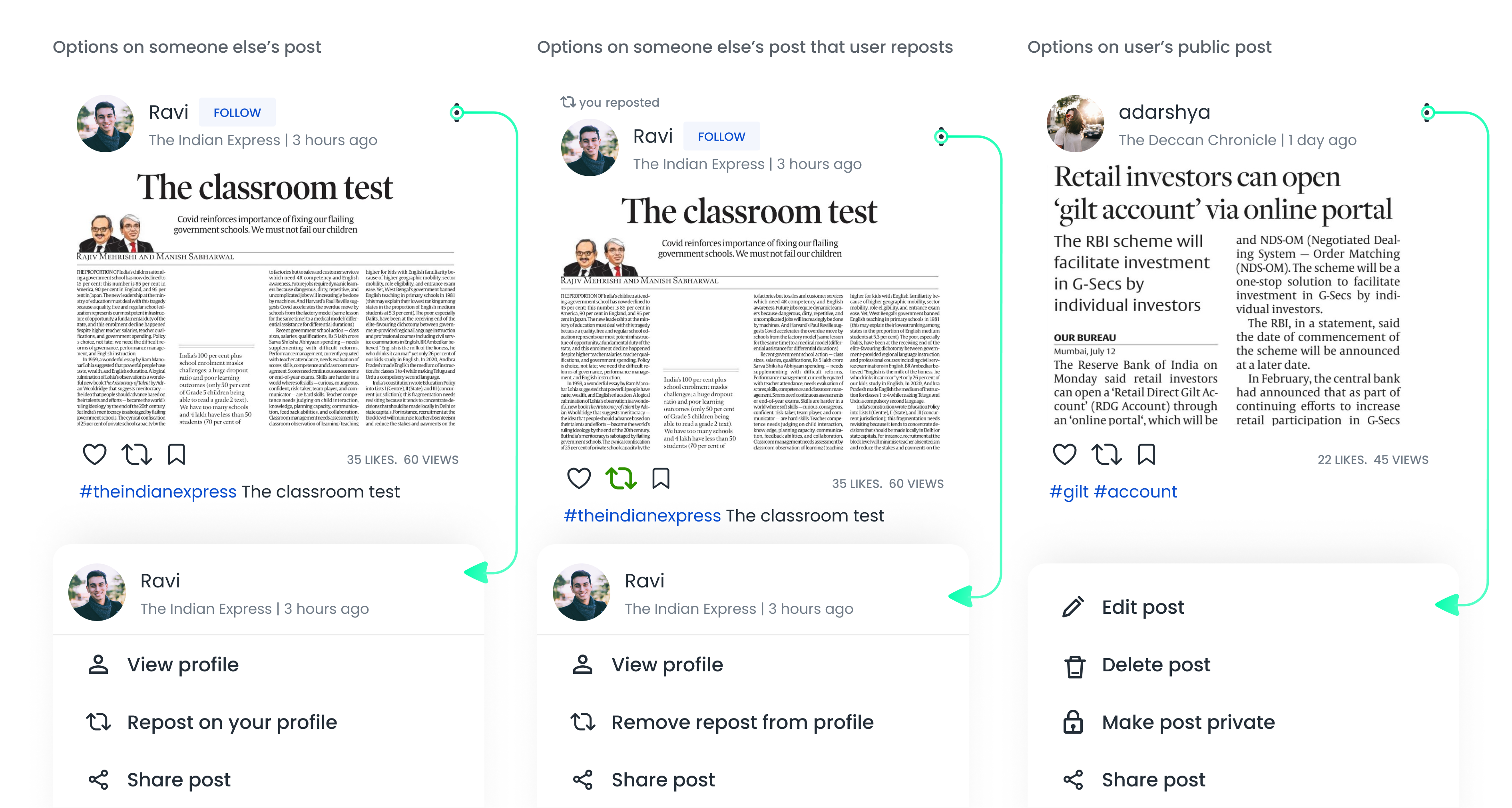
In my redesign, I included 3 new functionalities for every post.
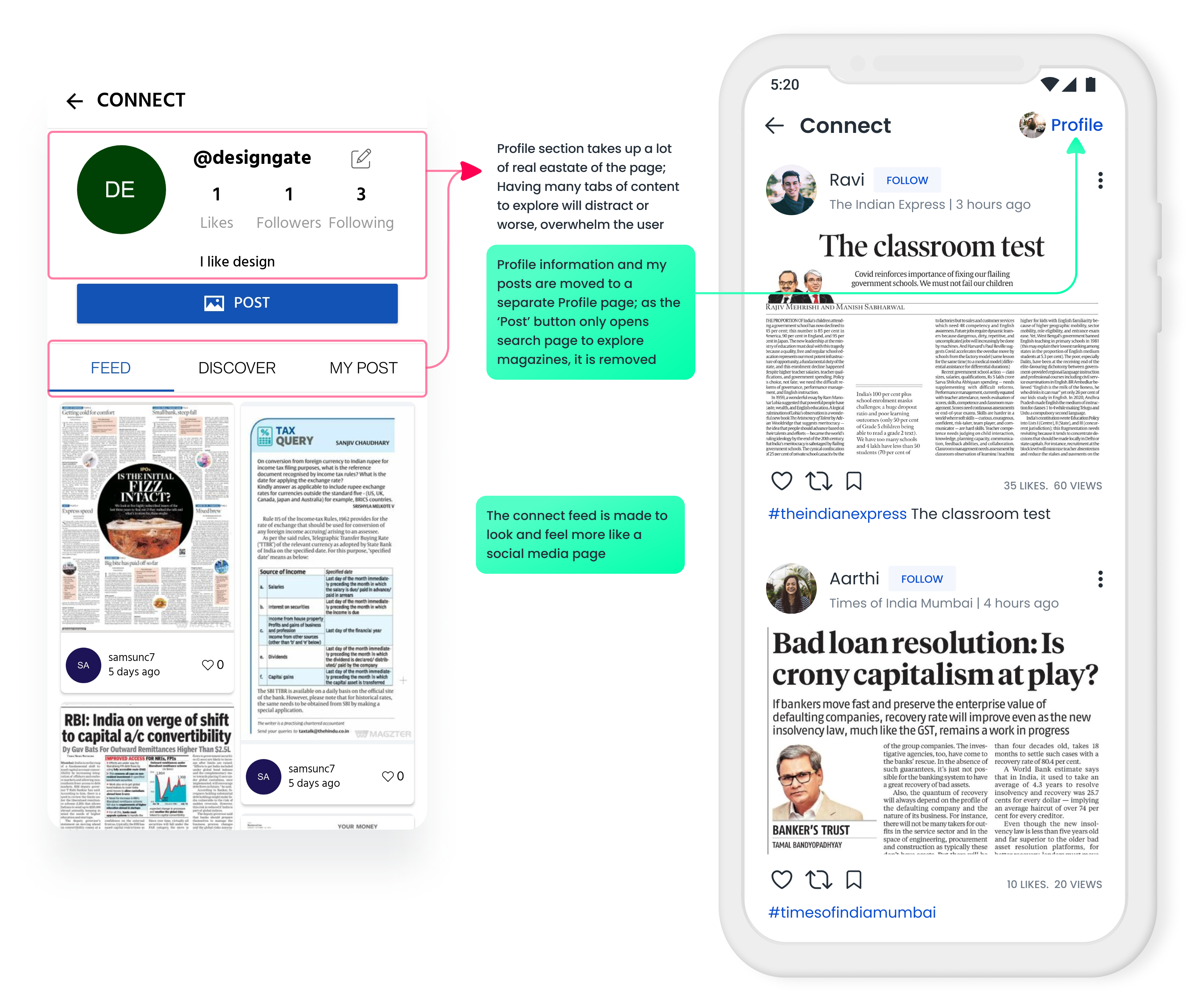
Each component additionally features an ellipsis that exposes a bottom modal sheet with context-specific choices. Users cannot edit, delete, or private posts in the current app. This is something I wanted to change since allowing people to reverse their actions is critical.
📐 User Control and Freedom is one of the basic Usability Heuristics of design which states that users should be able to quickly correct mistakes or backtrack on choices made. The ability to easily get out of trouble encourages exploration, which facilitates learning and discovery of features.
The user profile page has three tabs: posts, saved posts, and private posts. In the original IA, private posts are present in the Collections page of the app. In my affinity mapping experiment, I discovered that private posts belonged with the Connect function.
The majority of users do not include a bio on their connect profiles. This may be remedied by displaying a progress bar and prompting users to enter a bio.
🧠 Zeigarnik effect states that users remember unfinished or interrupted tasks better than completed tasks. Small cues or context changes can encourage users to make a certain decision without forcing them. I've provided this nudge in the form of a progress bar and bio entry in the profile page.
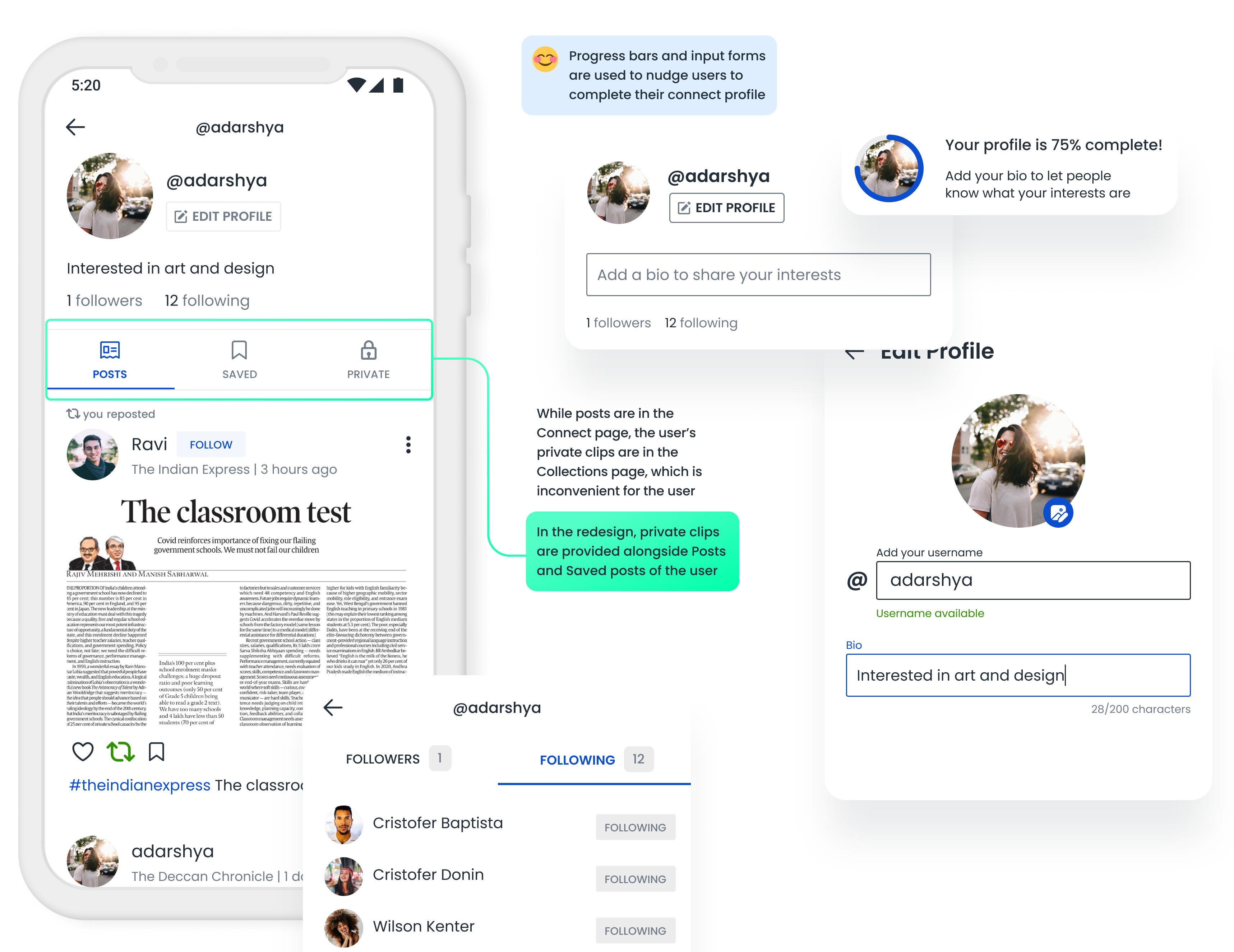
The current design also doesn't allow users to change their username once set, which I think can be rectified. I redesigned the post reader page to include all the new functionalities in an easily accessible manner.
One of the main issues with stories I had was that all the components were designed so that the title of the story was cut-off. The components were present all over the app, in Home, Search, Magazine Overview, etc. This was the main issue I decided to rectify in all the Story components I designed. I also included a section in the Stories page, which would allow users to follow hashtags easily.
💡 Topics are used to label stories. But in my redesign, I used hashtags to do the same, thereby removing the topics feature. This way, users need not follow two separate things to receive Clips and Stories of the same category.

In the story reader page, I replaced the download icon with the bookmark icon, as it misdirects users into thinking that the story is being downloaded, when in reality it is just saved to read later. I also introduced a feedback section right after the end of the story, with a minimal like-dislike design. This feedback can help feed the algorithm.
📐 Asking for user feedback is the most direct way to know if they like the recommendations or not. This can be a very valuable input that the user can give, with minimal effort.
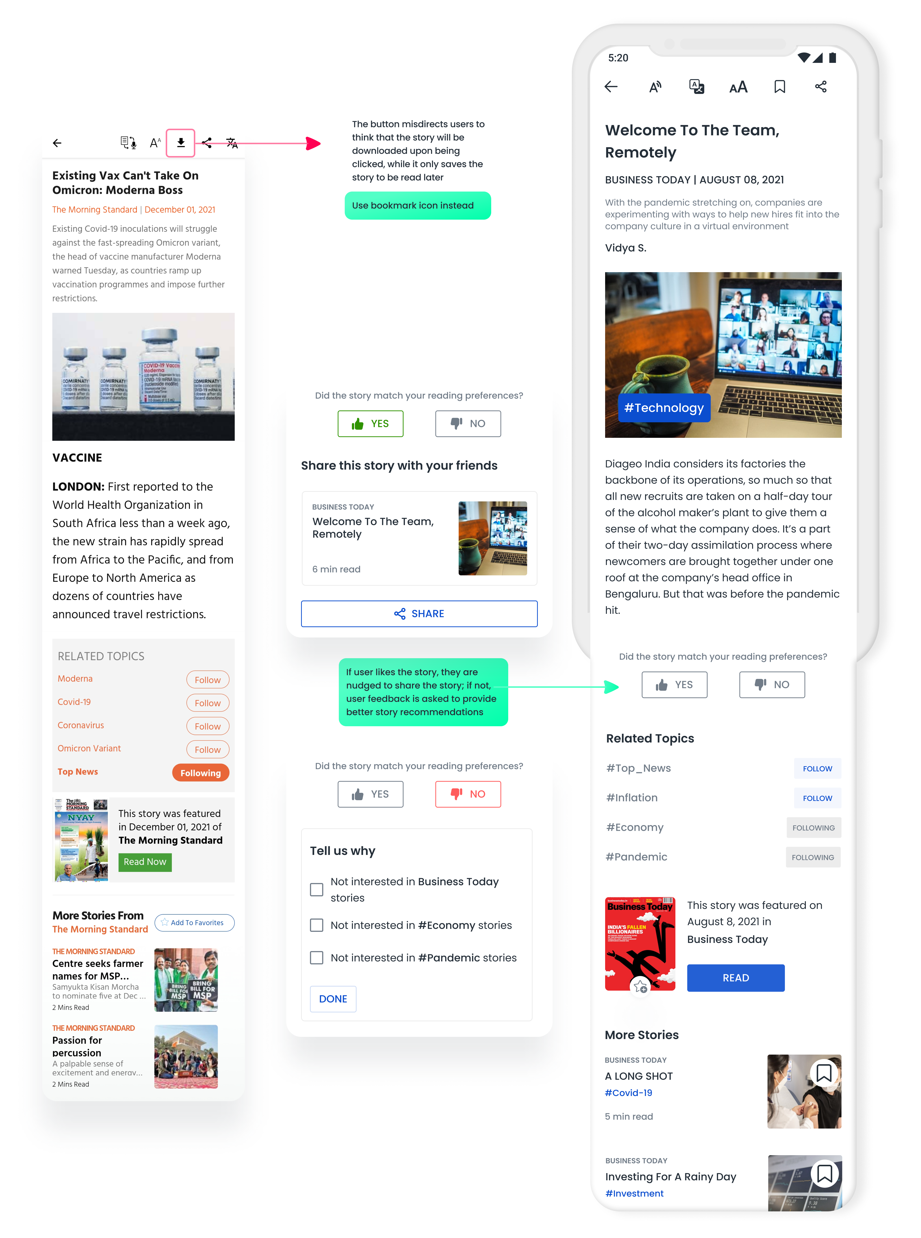
So as to not overwhelm users with an endless list of stories, we could show a curated list of few stories and once the user is done reading them, we can let them know they've caught up all their favorite news. If the users want to read more, they can simply load more stories.
🧠 According to Peak End Rule, people judge an experience largely based on how they felt at its peak and at its end. By providing an exit point, we can avoid users feeling overwhelmed and feel good about catching-up with the days news.
Although the redesigns above include a number of new features, I'd like to create a separate section to discuss the following few features because they are new to the information architecture.
In the existing design, toward the end of the already extensive homepage is an endless list of publications from 23 categories. Although this can show the vast collection of publications, increasing the number of choices will increase the decision time. This in turn causes decision fatigue and user will exit the app. So how do we give user's what they want? This is where personalization comes in.
🧠 Hick's Law predicts that the time and the effort it takes to make a decision, increases with the number of options. The more choices, the more time users take to make their decisions.

While making the homepage less cluttered, personalization onboarding also makes the homepage perfectly tailored to user preferences. This saves them a lot of manual customization. When designing, I made sure that users had exit points and skip options every step of the way, so as to not compel them to go through with the onboarding.
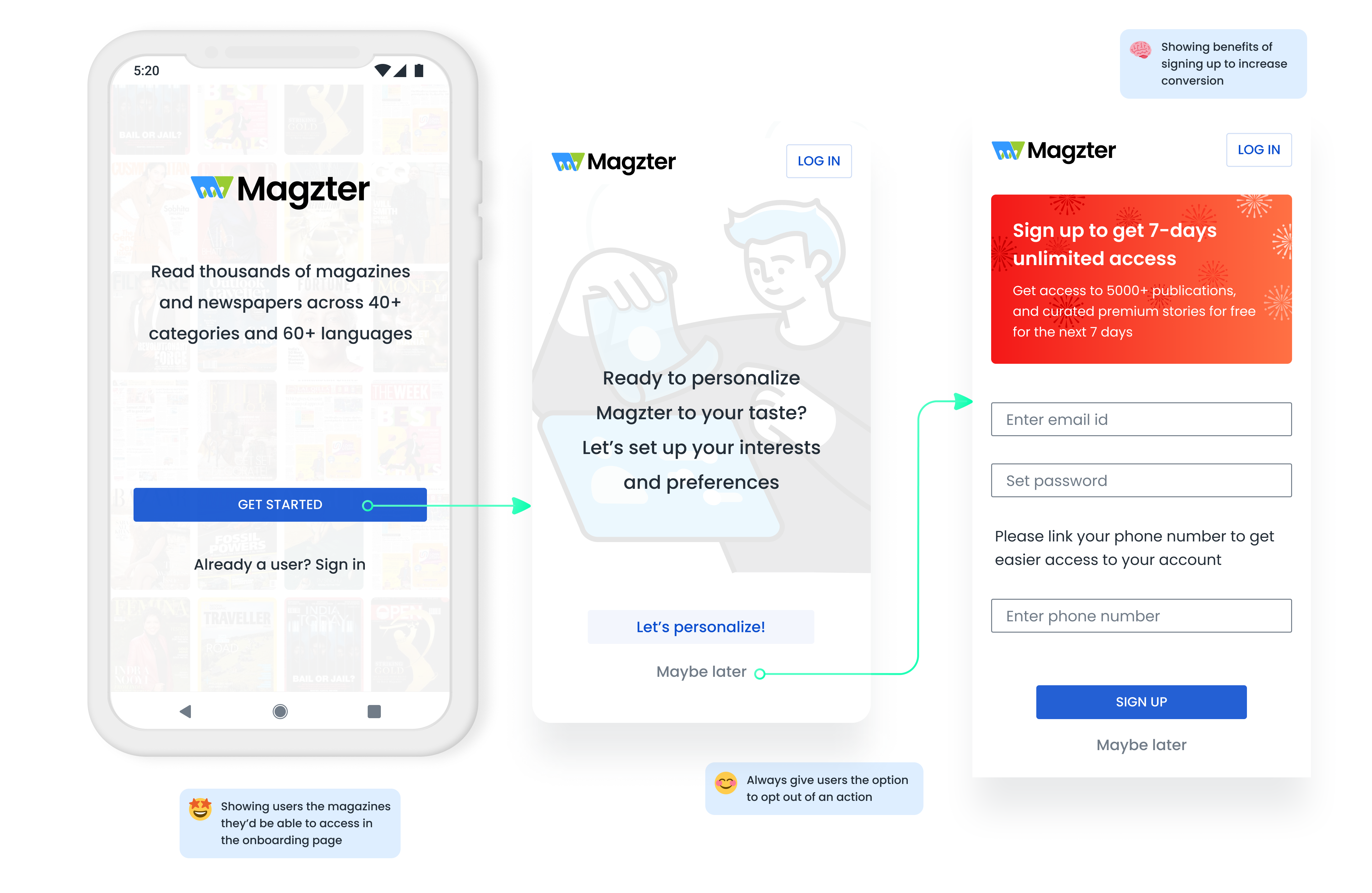
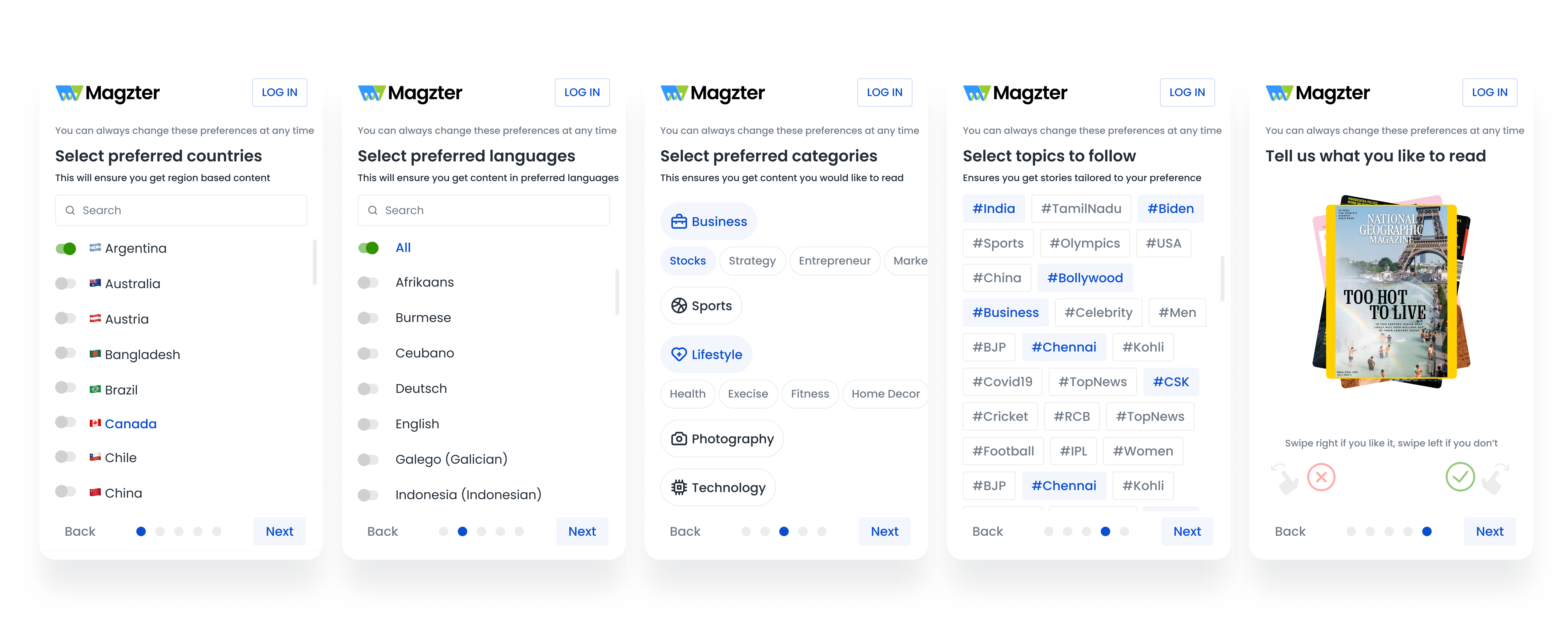
I used a multi-step form to get users to select their preferred countries, languages, and categories. Based on this, a collection of topics are recommended for the user to follow. This is followed by showing users a collection of magazines, that they can swipe ( right if they like it, left if not ). This will give users an idea of what to expect.
📐 The smaller the initial ask, the more likely they are to agree to gradually bigger requests. Especially since the brain likes to be consistent with its previous actions. It's part of the reason why multi-step forms can perform up to 271% better than a big single-step form.
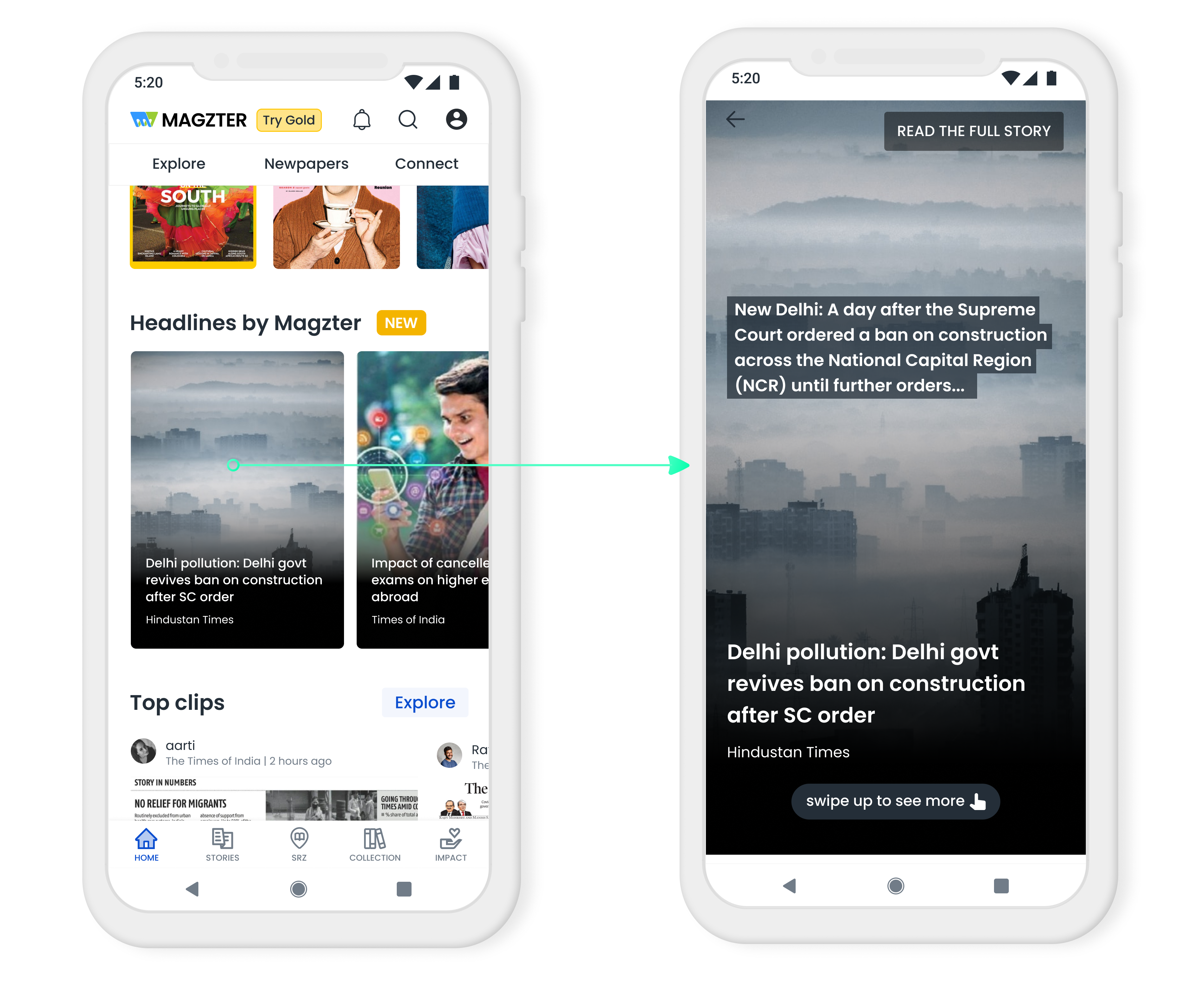
With apps like Youtube, Netflix, and TikTok adopting the content swiping feature, I thought I'd try the same to provide news content. The Headlines feature provides users with a short heading and a brief look inside the news article. By clicking on the page or the 'Read the full story' button, users can easily access the original news article.
🧠 Users have a desire to seek out missing information. This curiosity gap comes in the form of giving users a peek of the news, without letting them know the full story.
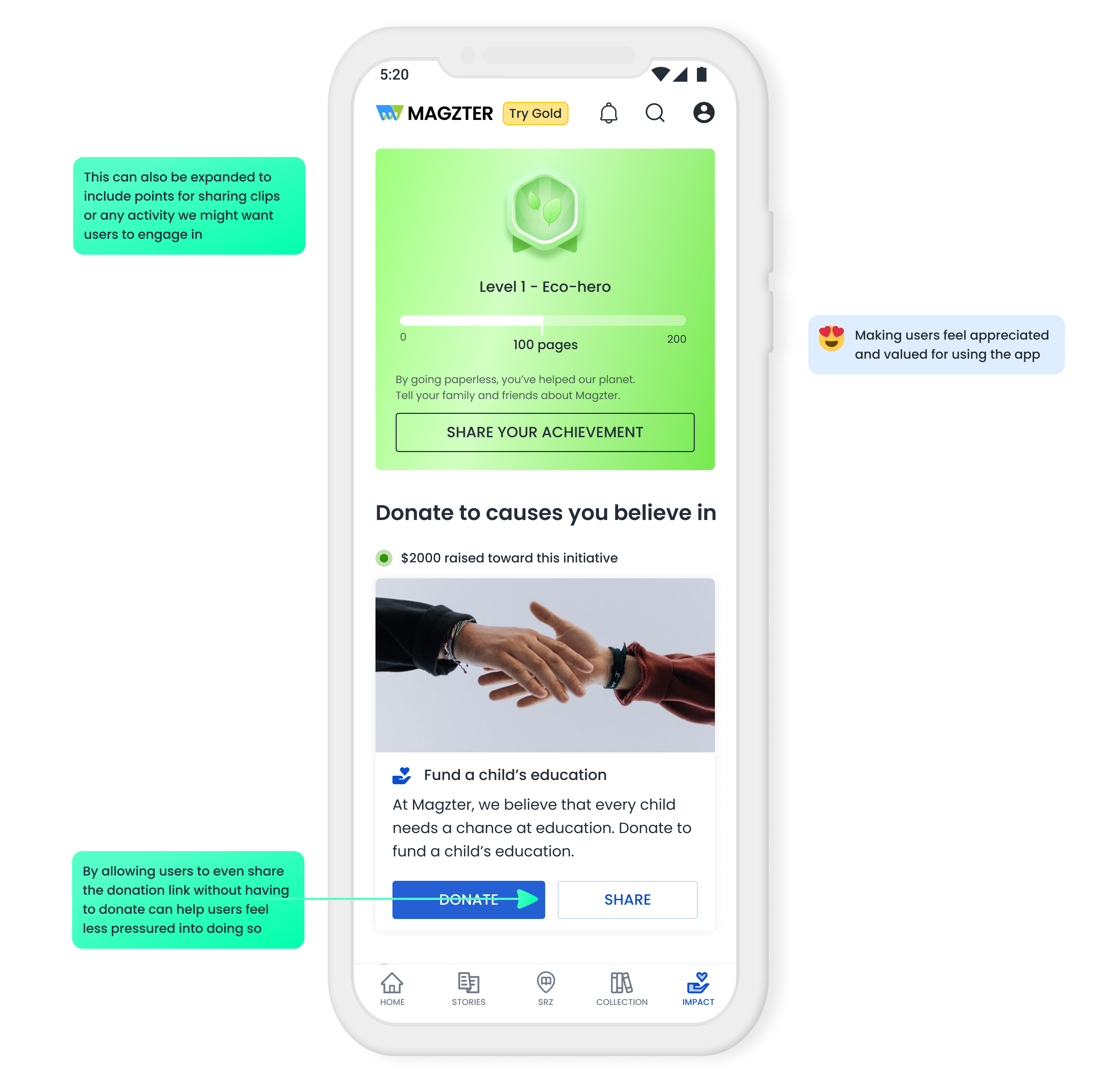
To encourage people to read e-publications, I tried to gamify reading. As the user reads more and more pages of content, they will be awarded with badges. This can be adopted for other activities we might want users to engage in, such as, providing them with points for posting clips. I also show them ways they can donate to organizations in line with the company's core goals.
By allowing users to share their achievement or the donation link, the app could be promoted to download by the users themselves.
Being my first redesign challenge, taking on redesigning the whole app has been a great opportunity for me to dive deeper into Information Architecture and visual design. Although this is a complete revamp of the existing app, the implementation of the design would take place slowly over time so as to not overwhelm the user.
During my analysis of the app, I noticed the creative decisions behind the existing design and made sure to preserve what I found valuable. Design is an iterative process and I realised that there’s nothing like too many iterations because the more you iterate the more chances of the best solution. This project helped me expand my usage of Figma and uncover many techniques I wouldn't have used extensively otherwise.