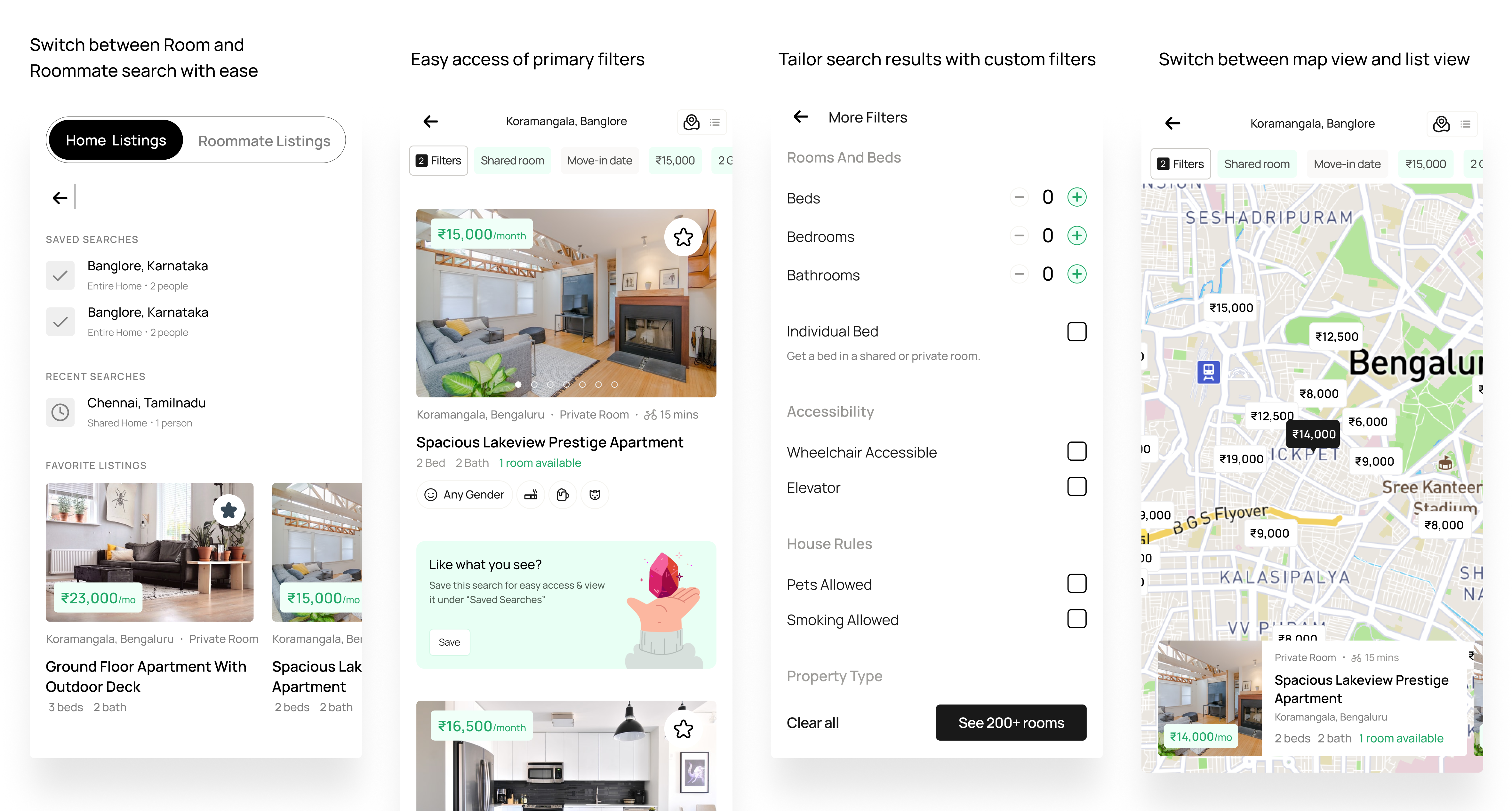
Ideated and designed an entire app from scratch to connect renters and homeowners, and to tackle the daunting task of finding roommates in a new city. I collaborated with another designer on this project. We conducted user research, created personas based on different user groups, developed the brand design and design system, ideated features, and built prototypes.
Today, the experience of looking for a flatmate is rather fractured. You join a Facebook group, search through Twitter, ask your friends, all in the hopes of finding someone with whom you may share a house. But there is so much that could be improved about this experience.
So, how can we make things better? But for that, we first need to understand the problem in detail and how people are currently solving this problem.
India is home to around one-fifth of the world's population. More significantly, the country is one of the youngest in the world, with a burgeoning middle class. According to Census 2011, there are a total of 27.37 million leased households in India, with urban rented houses accounting for about 80% (21.72 million), half of that being 3-4 person households.
🏚️ Despite the enormous housing need, millions of residences remain unoccupied in metropolitan areas.
With rising costs and dwindling resources, the housing shortage for this massive population has become a big issue.
In 2018, millennials made up around 42% of the workforce in India's top seven cities. To them connectivity to their employment, convenience, and security are more important than property ownership. Dwellings are considered as transitory commodities.
In addition, university campuses continue to face a capacity accommodation restriction usually meeting about 30% of their entire student housing demand. This represents a demand for off-campus accommodation from over one million migrant students across the top seven cities.
Living with roommates may be a nightmare. They leave their dishes in the sink, never take out the garbage, and eat that last slice of pizza you were saving. There are upsides of course.
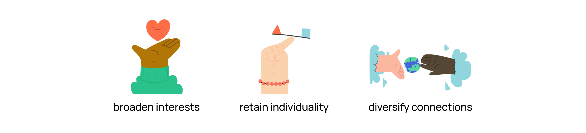
However, this necessitates a decent mix of solitude and social life, a space where we may be with like-minded people without being judged. Shared living places might seem more like home than anywhere else, and our roommates can make such areas feel safe.
We want to provide a platform for this populace to find a place to stay, with the right people. We decided to design an app that helps users find the right roommate and make the daunting process of moving to a new city easier.
After brainstorming for a bit, we divided our user group is divided into two:
We found that these two user groups overlap to form another user group.

Of these, we assigned user group 2 as our focal persona, as they would be the target end user for the problem statement. Our secondary personas are user groups 1 and 3, whose goals can be easily met if we solved the focal group’s goals.
We did a survey asking people in social forums about their roommate finding experience and interviewed a few people we knew. Based on the research, we created 2 user personas to help navigate the problems better. These personas collectively represent the views, goals, pain points, and motivations of our interviewees.

From our user interviews, we came to know what platforms & services our users used to currently meet their goals, and we analysed competitors who provide the similar services.
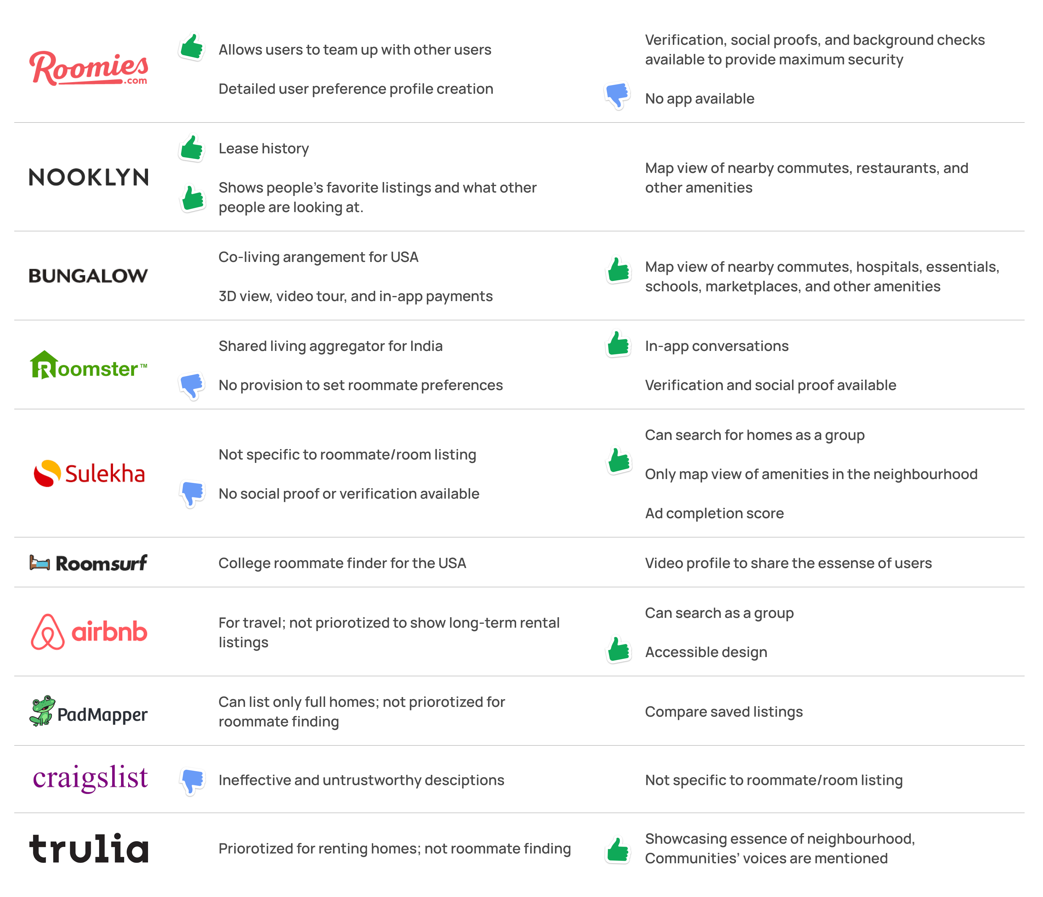
We went through many more apps and websites than listed like Roomi, Flatmatch, Cirtru, Flatmate, Findmyroom, Indianroommates, and Kijiji but they did not have any unique features that hadn't already been mentioned above.
Social media services like Facebook, Reddit, Instagram, and Whatsapp were also used to solve this problem. But they presented a multitude of problems like:
From our thorough user analysis, we plotted out the expectations and pain points of our users and grouped them into 6 main goals, where we discovered accessibility to be another priority goal for a subset of users.
💡 By solving for people with special needs, we might in turn offer better services for common people. 'Design for one, use for all'

We decided to mention specific goals and their obstacles in these 7 categories and from thorough research, we were able to provide solution which we will convert into features
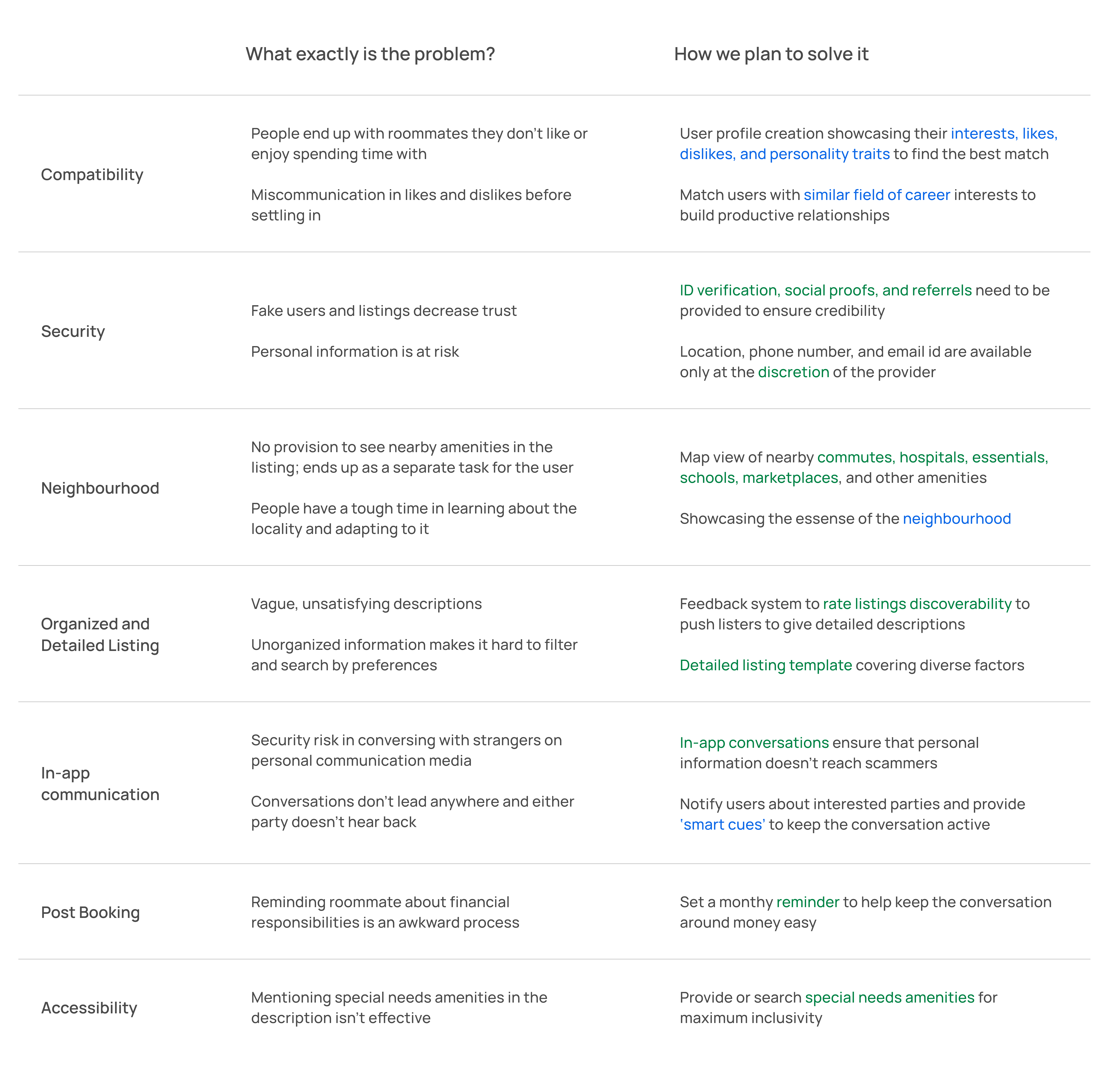
Other than these, we came up with more features that address other goals:
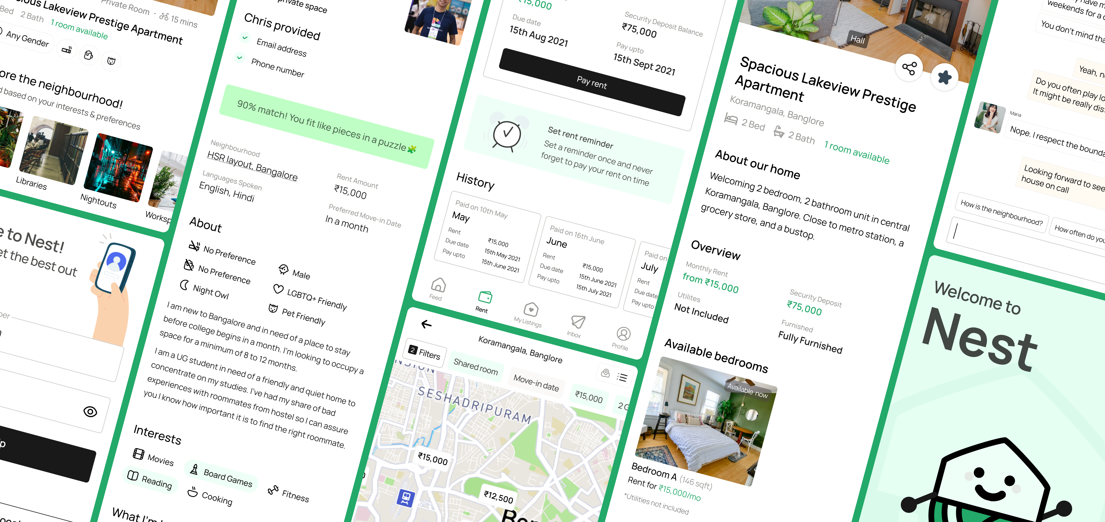
Nest is a home and roommate finding app. The apps core features are:
.png)
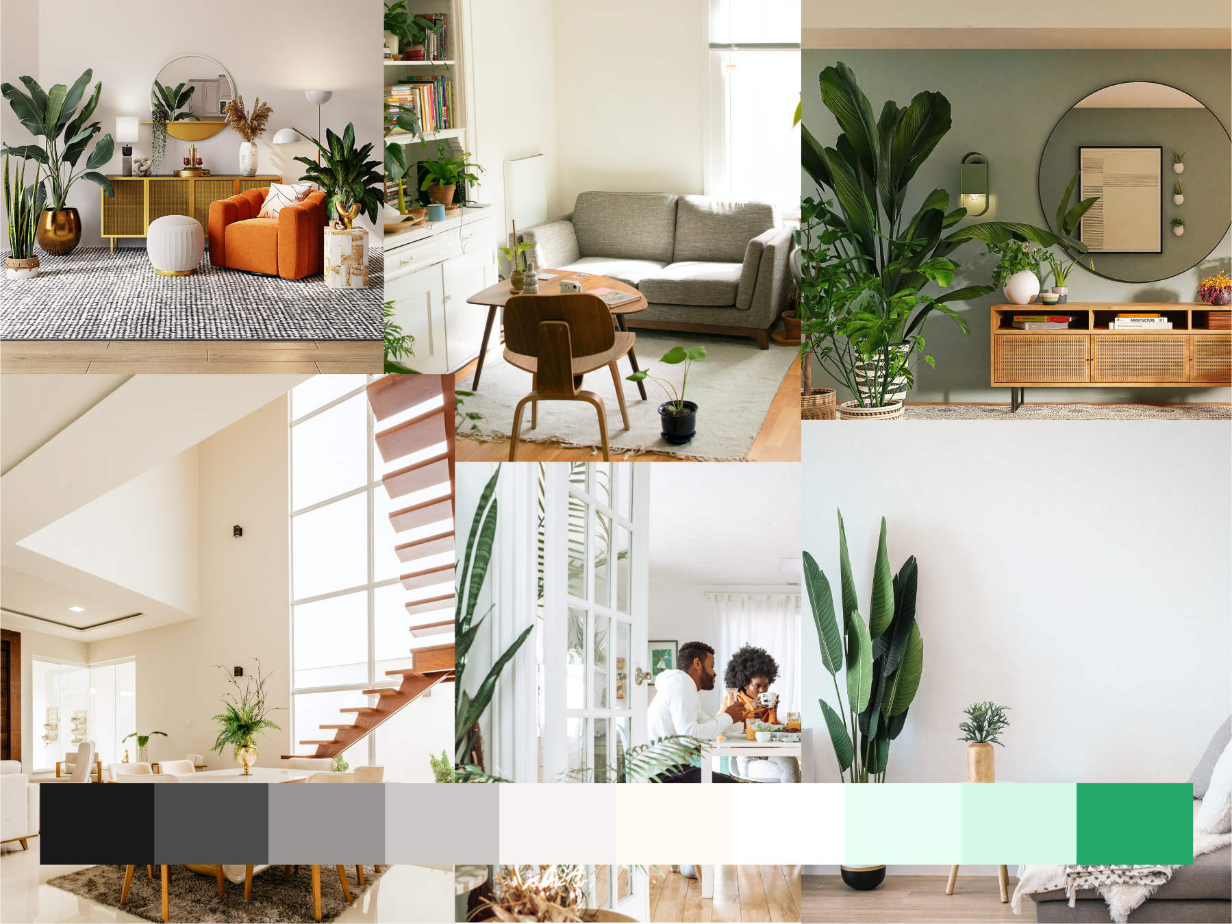
We sampled a few images of cozy homes from Unsplash to find out which colors were most used by people. We noticed that a significant number find homes filled with plants to be more calming. Which is why we made our brand color green!
Speaking of cozy homes, we brainstormed things that signal the word ‘home’ to people. This lead to ideating on words like ‘cocoon’ and ‘burrow’, but ‘Nest’ was our final pick.
We also chose the font Manrope, which was circular, and clear to read even when it was in light font weight.

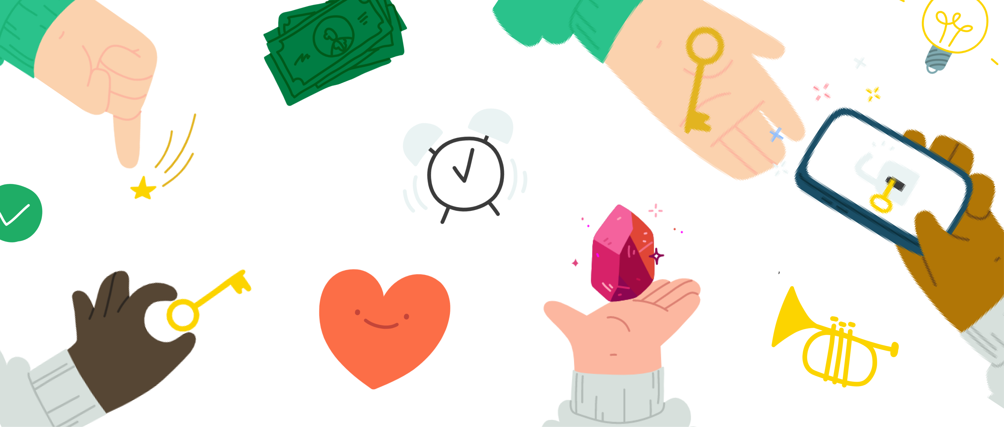
We used Blush’s free illustration pack ‘Hands’ for our app to convey a more user friendly vibe.
I will take you through the user journeys of both Maria and Chris
Maria and Chris both download Nest and are greeted by Nest Buddy. This cute avatar immediately makes them feel welcome.

🥰 In the design stages, Nest buddy was informally called 'Nest Boi'
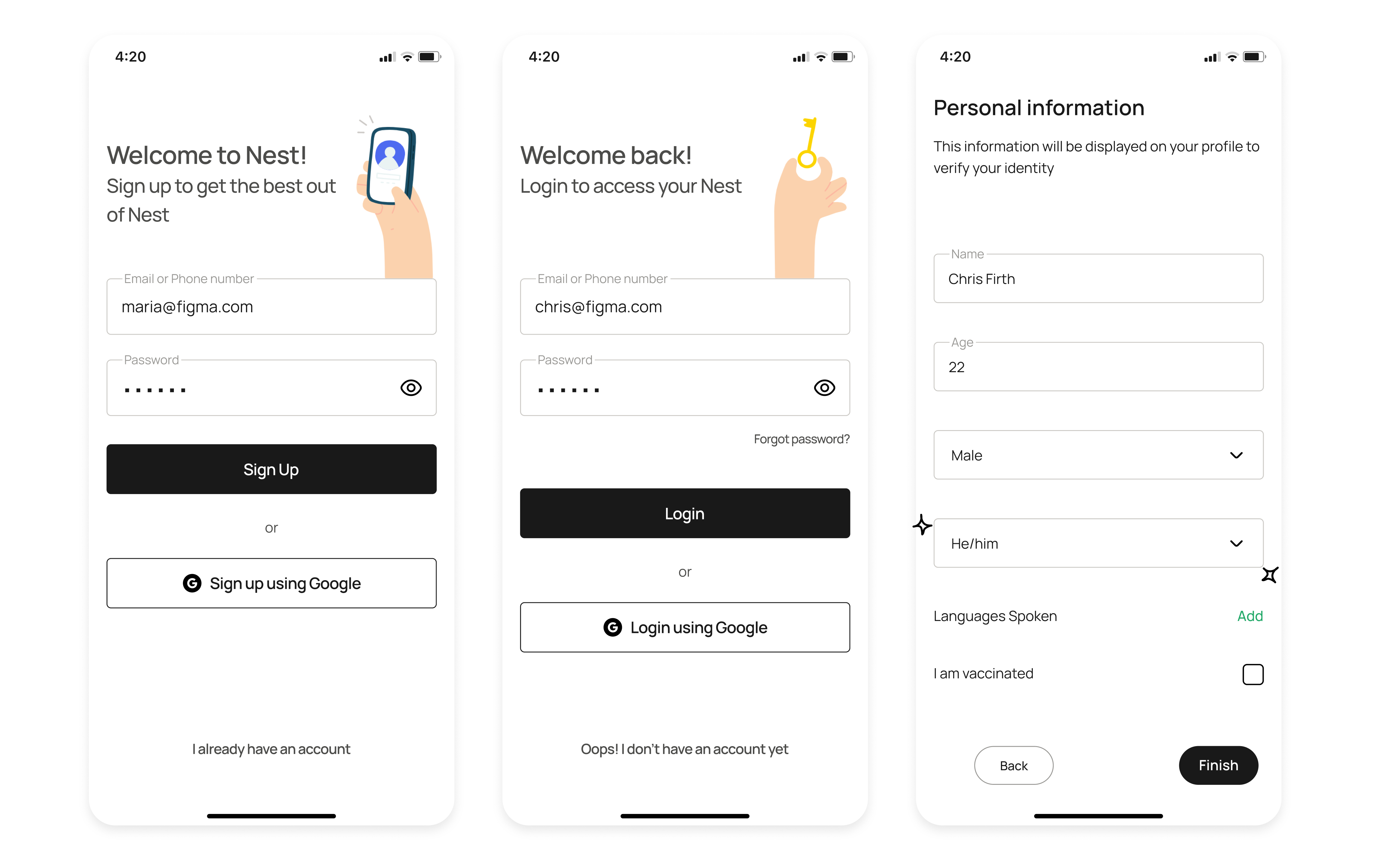
This is followed by asking them what type of user they are, to customise the onboarding flow.
.gif)
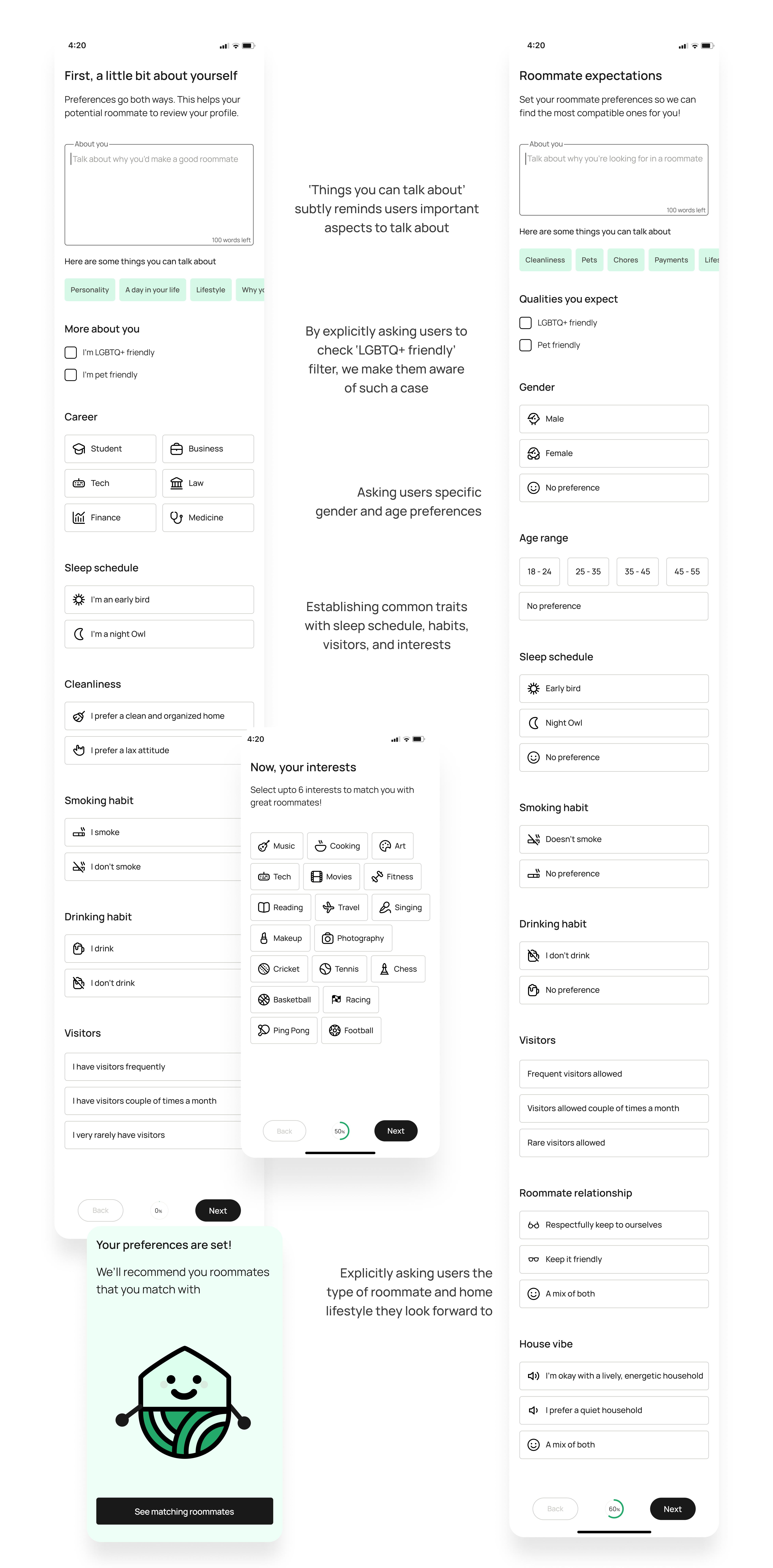
The Sign Up page prioritizes gender and pronouns for better representation
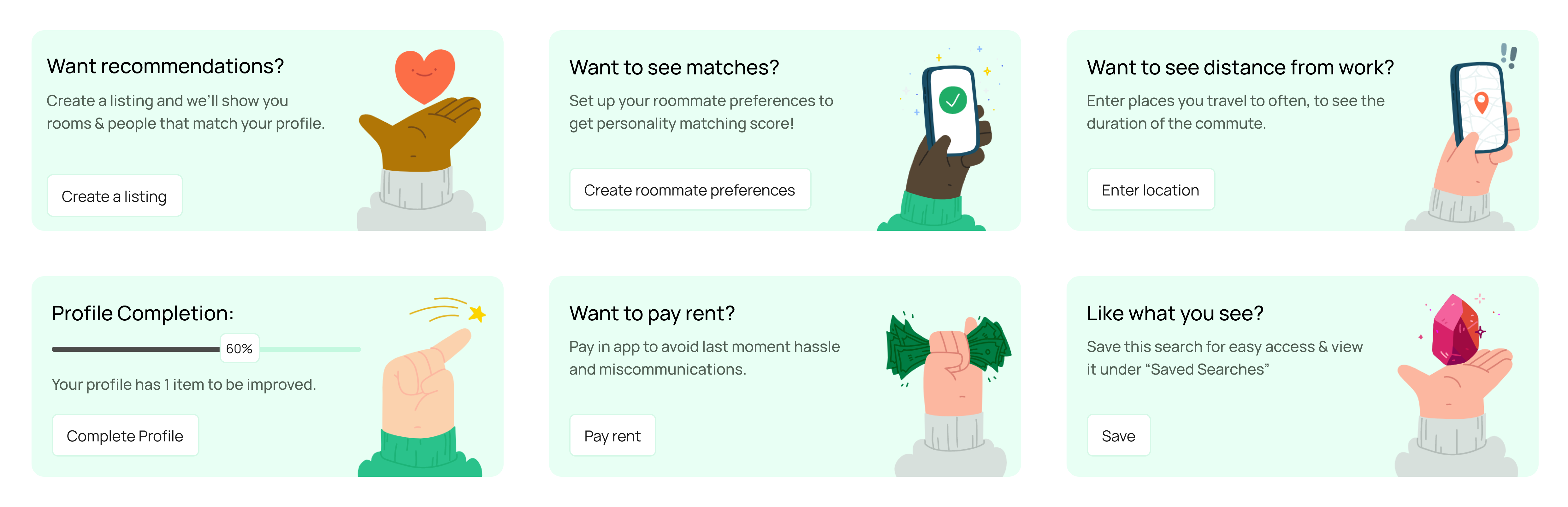
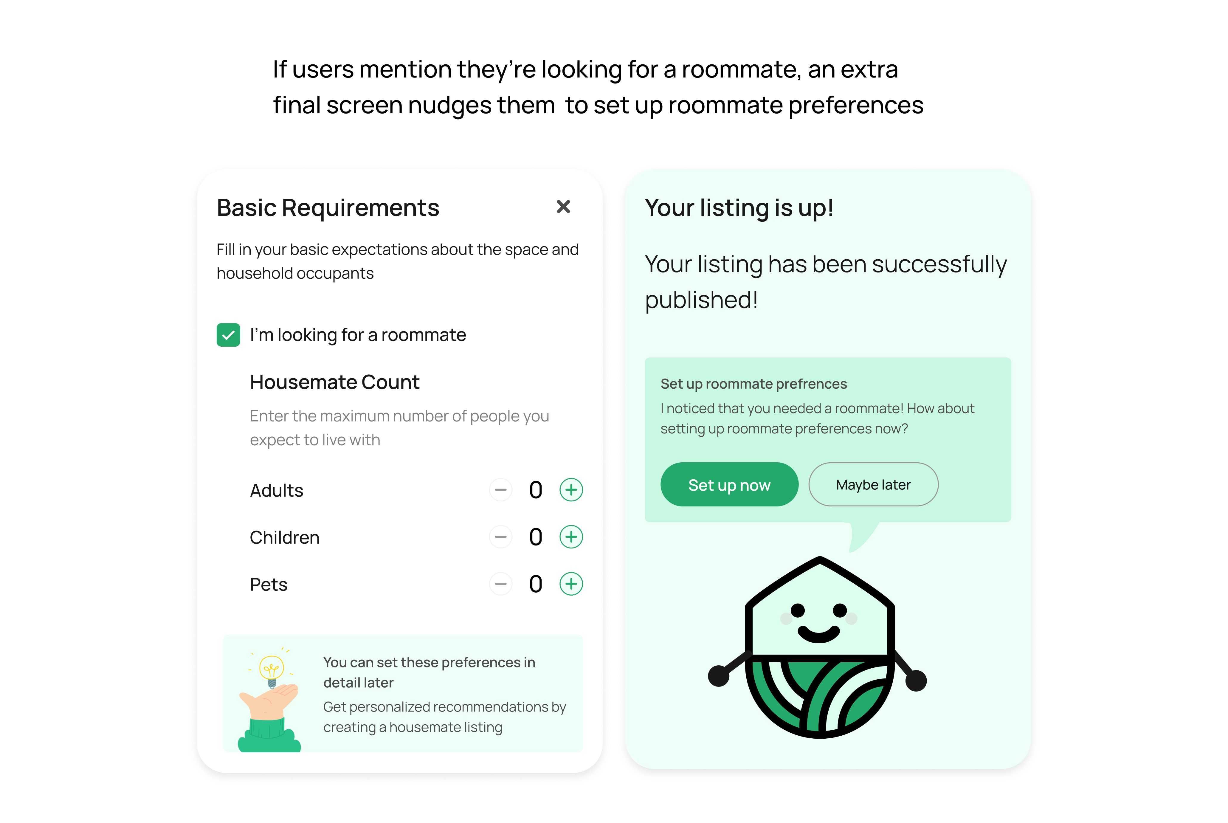
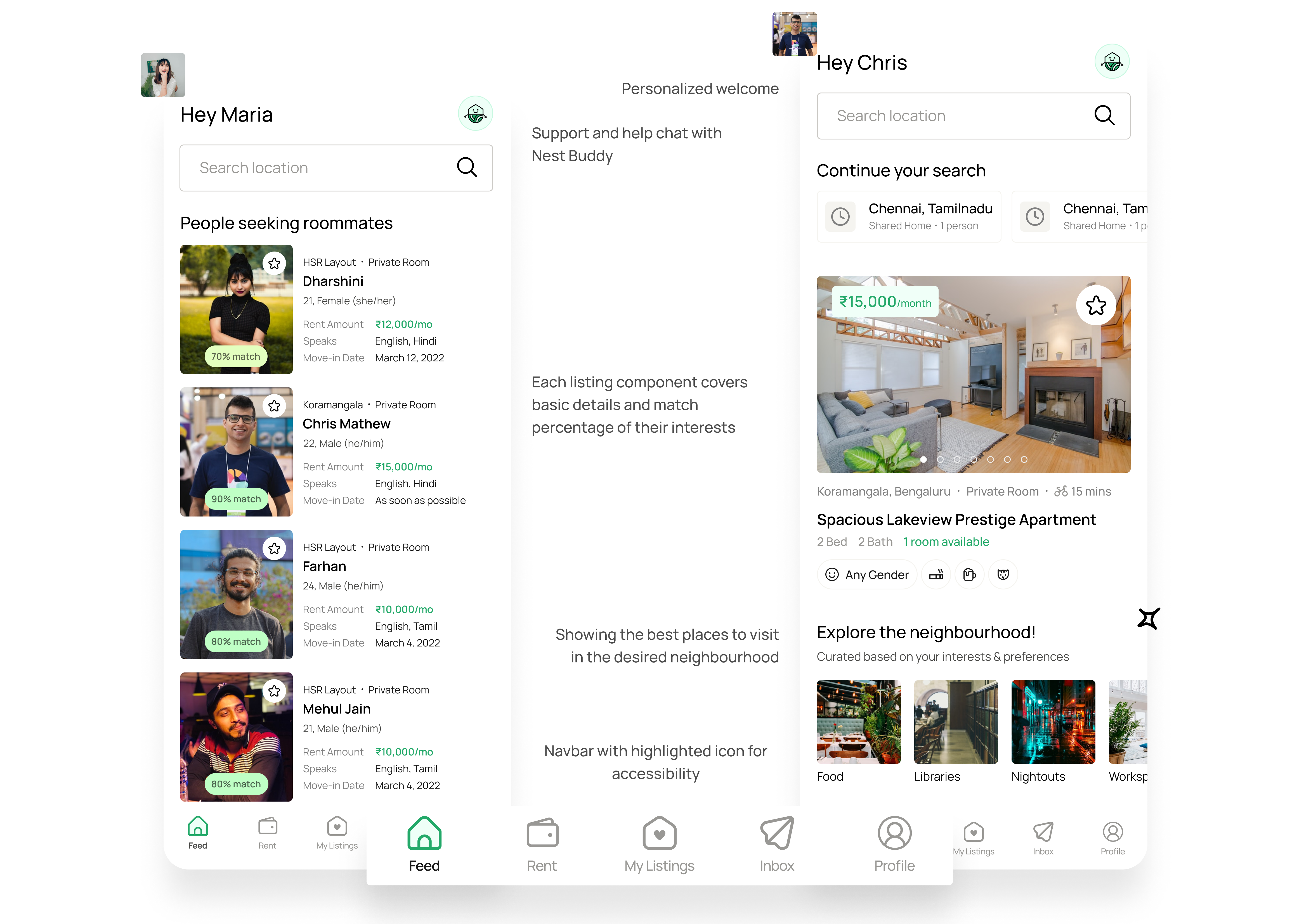
Now that they have been onboarded, Chris and Maria are shown a home screen with listings that match their needs. But they aren’t allowed to view a person’s details unless they create their own listing. This is brought about by peppering friendly nudges throughout.
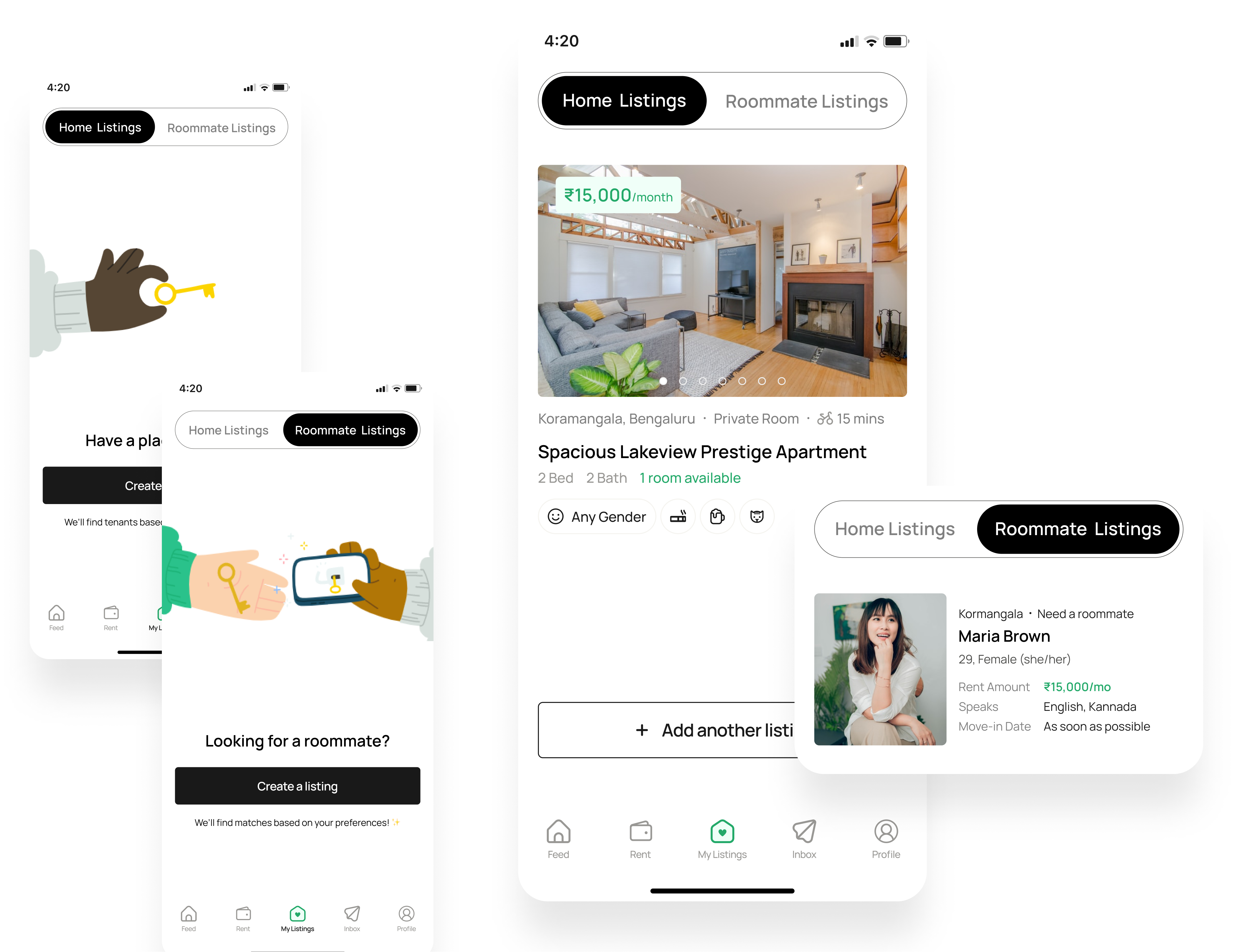
Both Maria and Chris then create a home listing that encompasses all the details of the property they own / their home preferences.
A breakdown of the above flow (some screens have been omitted):
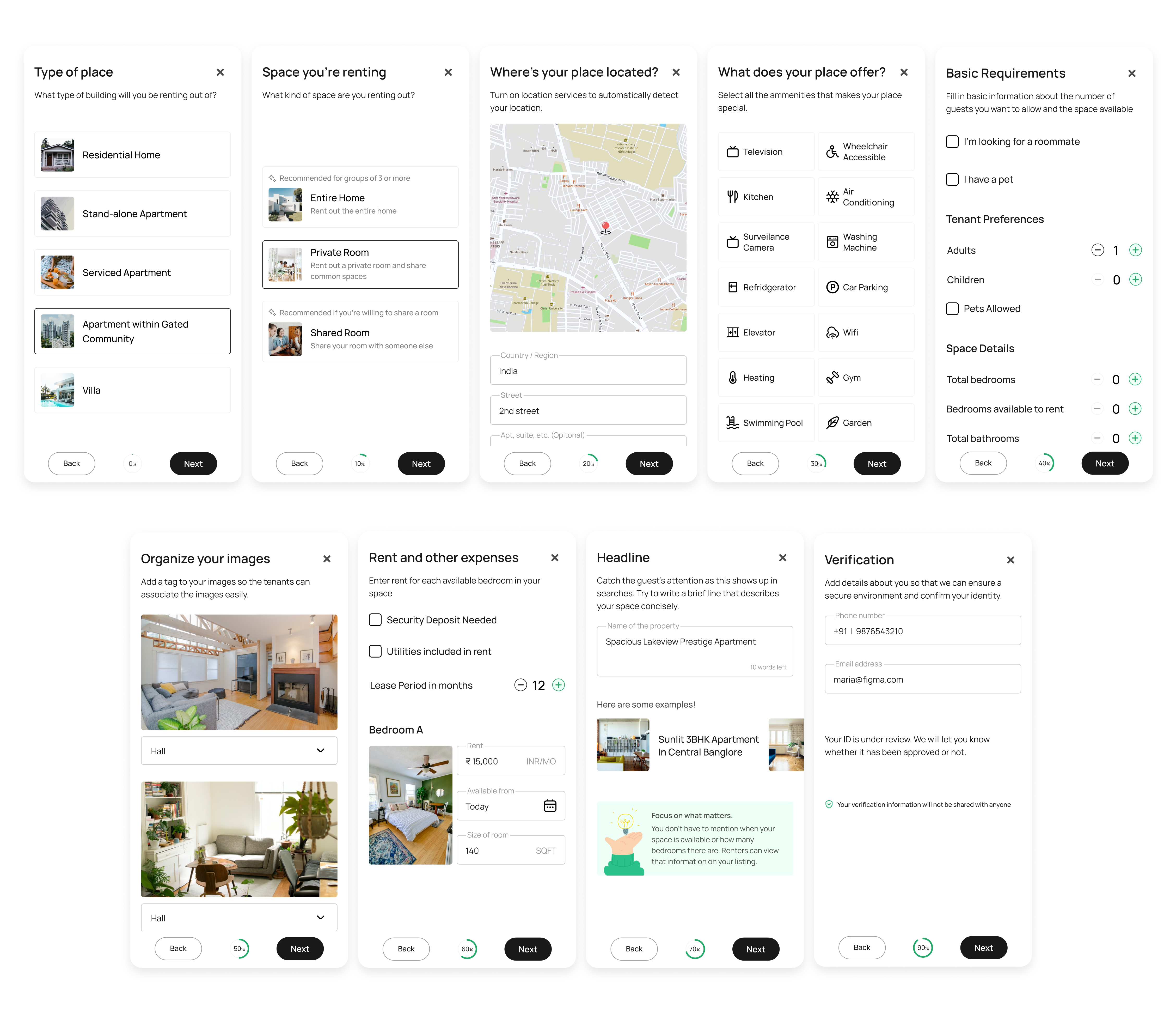
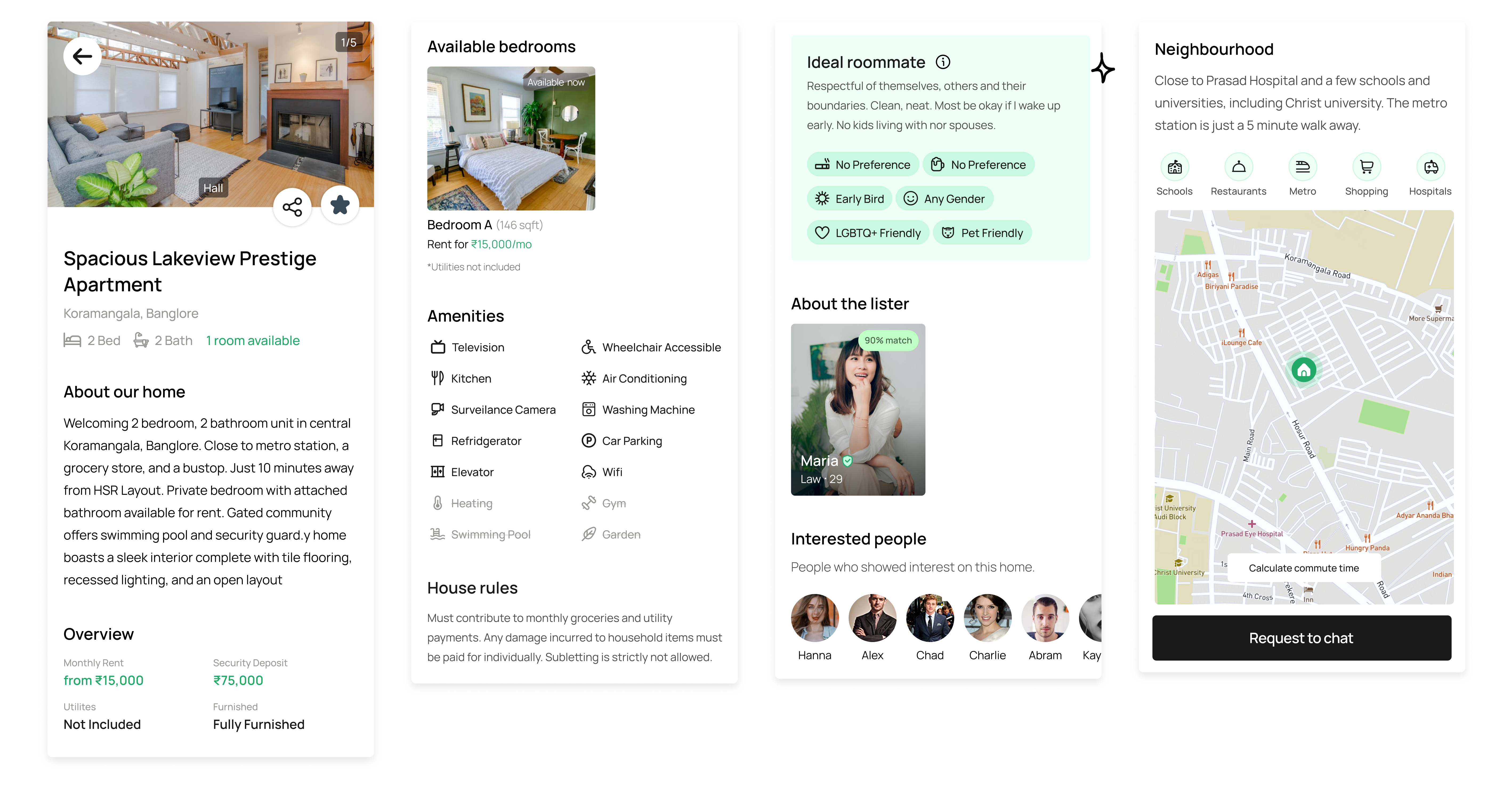
The listing details page holds information about the home.
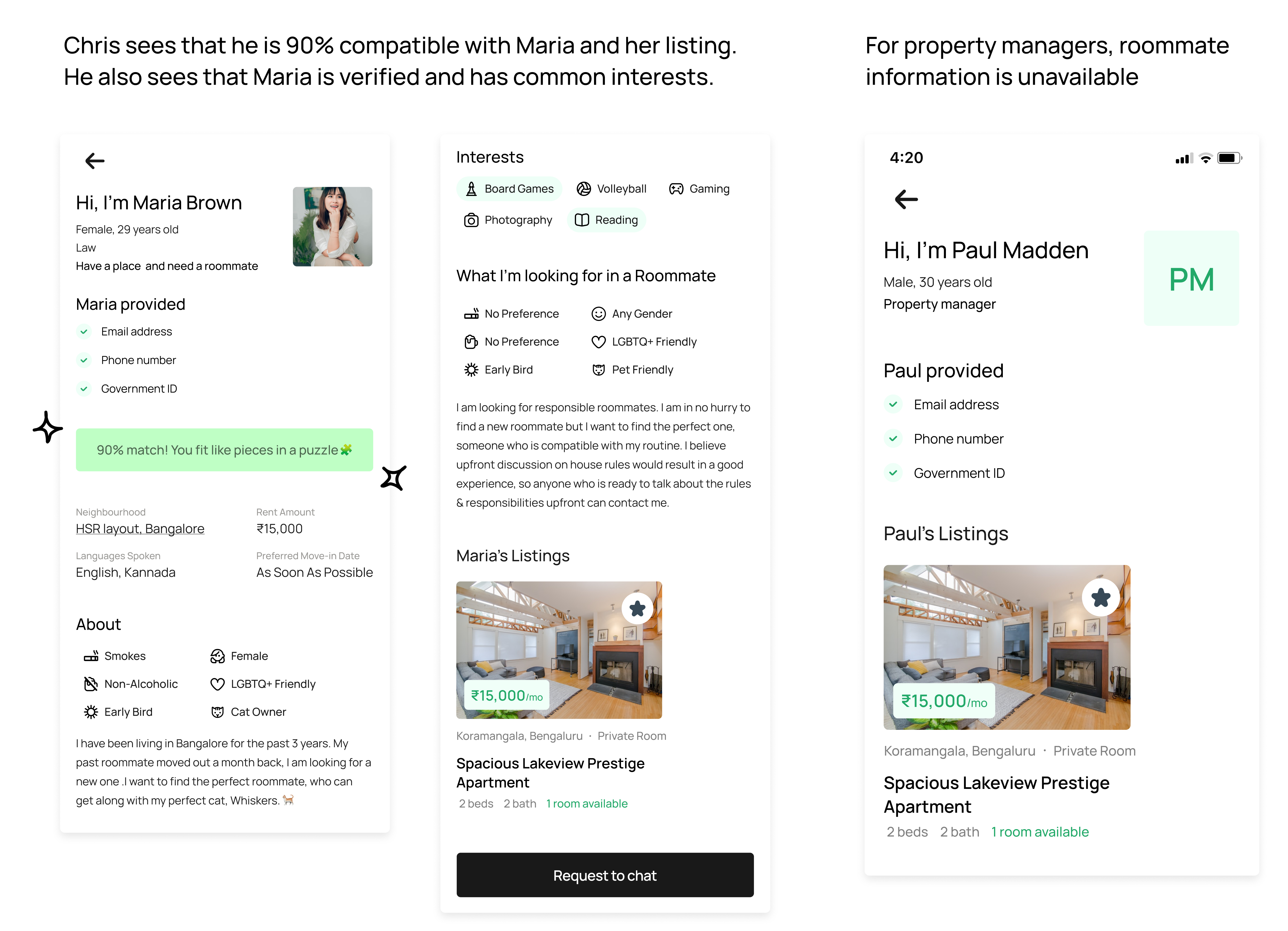
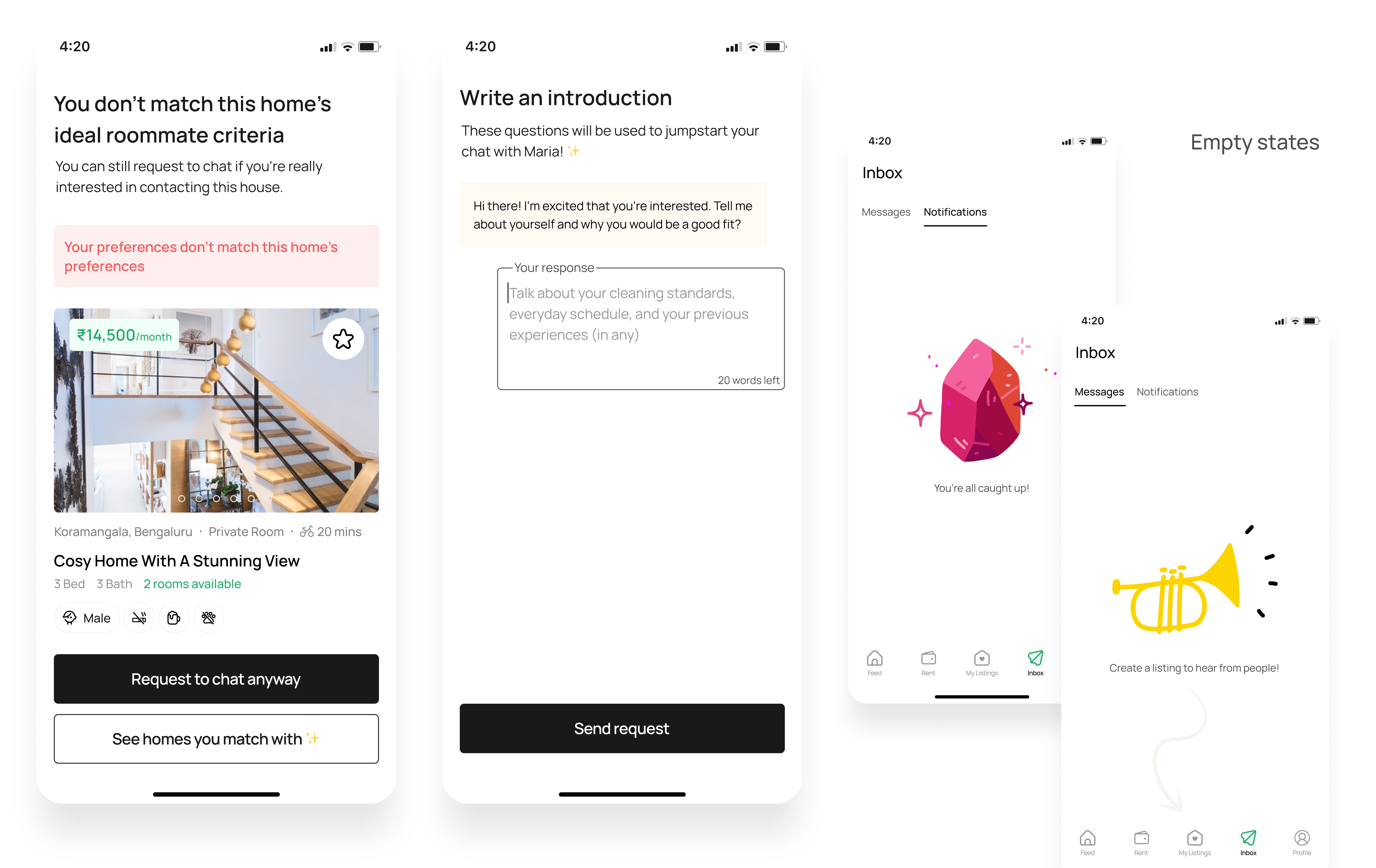
If Chris tries to chat with a home with very low compatibility, the app will warn him before doing so. Also, the app pushes him to write an introductory message to a prompt Maria has put up. This question helps jumpstart the conversation.

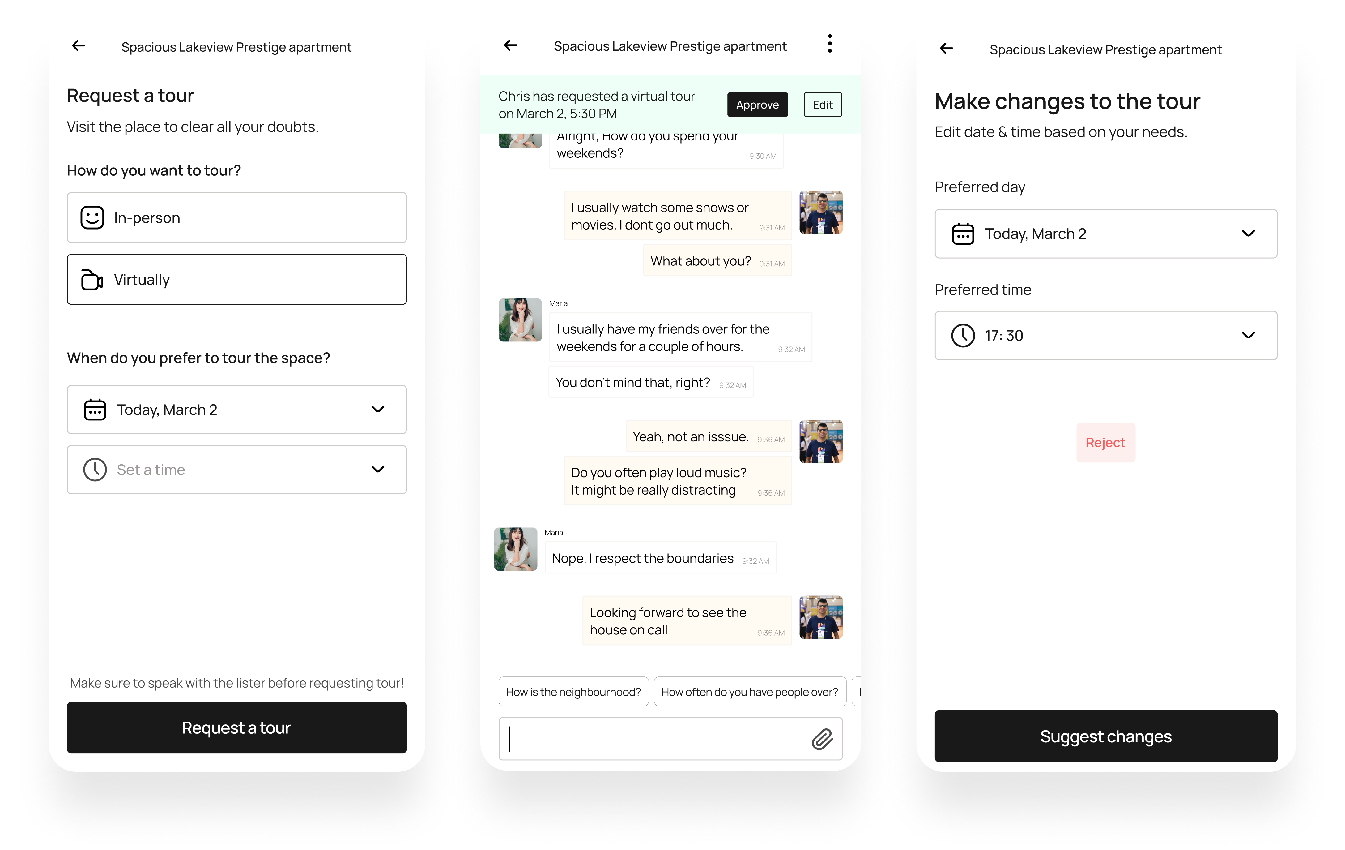
Chris can request for a tour of the space either in-person or virtually to Maria. She can either accept, reject, or make changes to the tour timings

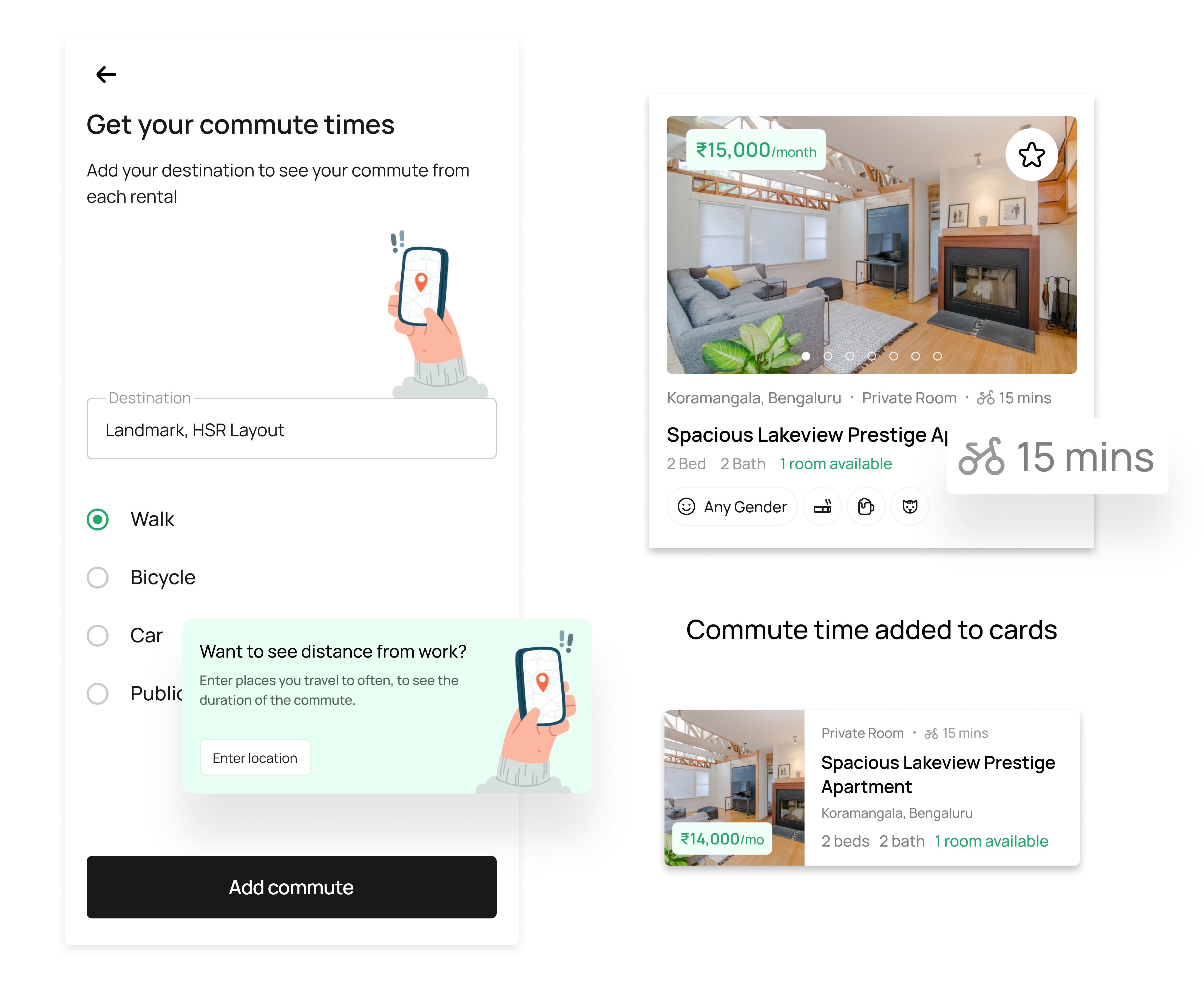
Adding destination and mode of transport activates commute times on listings. This is especially useful when the travel between place of work or study is important. Users can sort listings based on commute time.
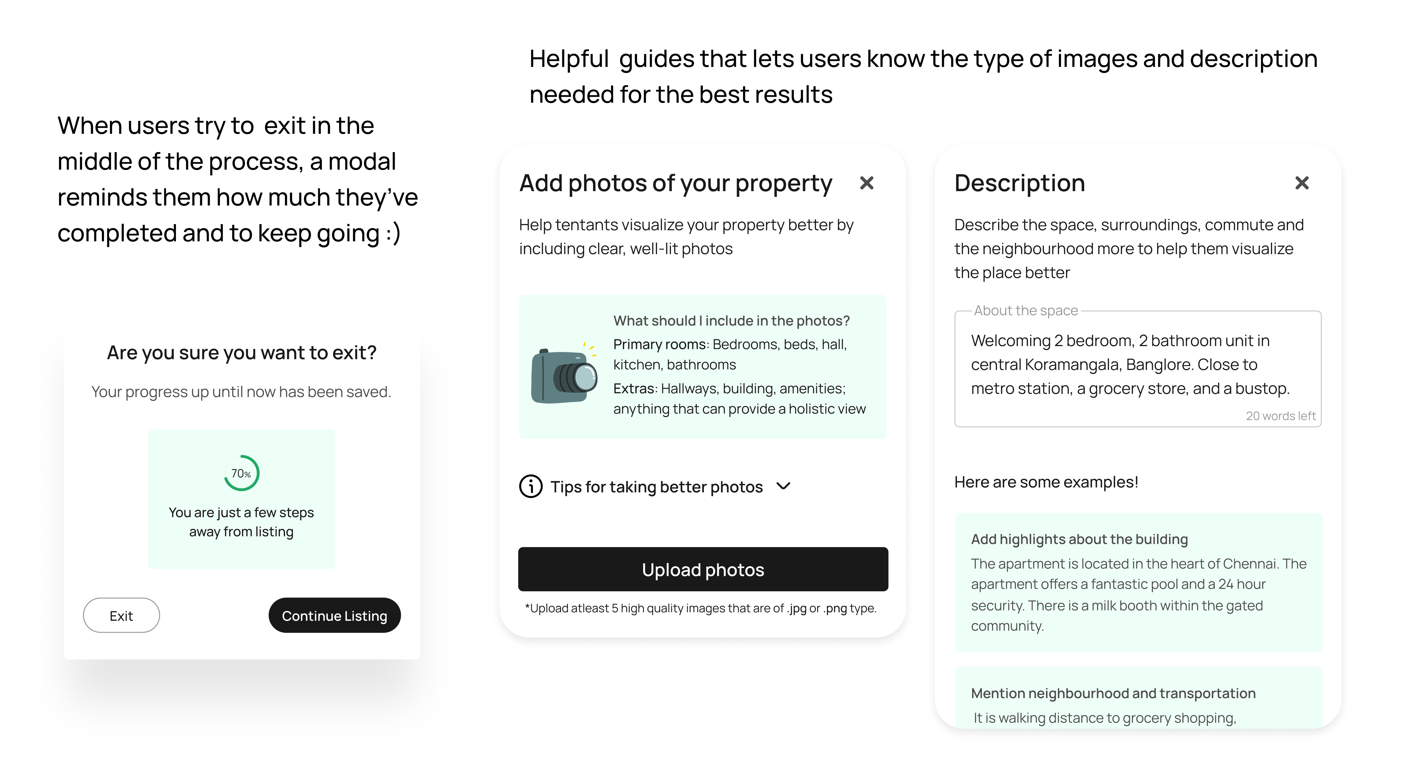
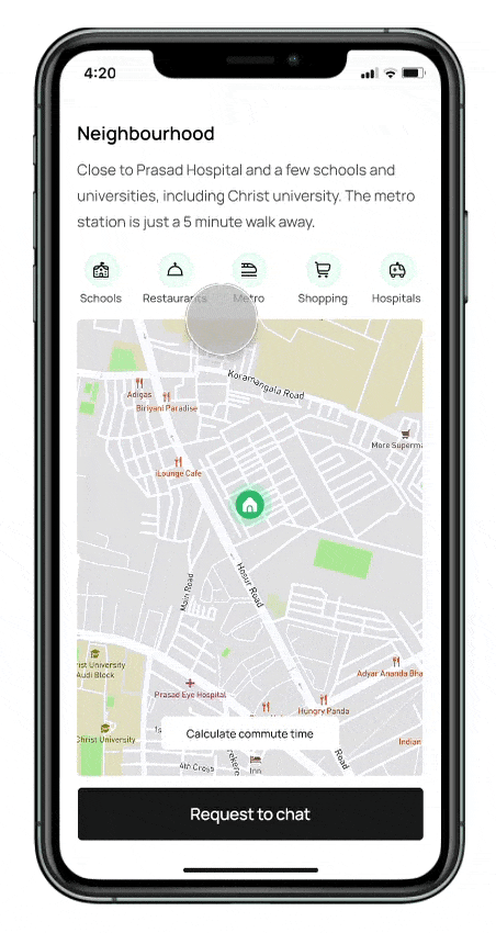
The neighbourhood section in the listing details page offers a section where the lister can give a textual description of their environment. Nearby localities such as schools, restaurants, metro stations, shopping plazas, and hospitals. Commute could also be calculated in this section.
This negates the need of going out of the app the explore the locality
Being my first collaborative project, I learnt how to compromise and communicate design decisions. When we brainstormed for this project, we came up with a lot of features. But since we were slowly moving toward a feature creep, we decided to cut back by using a priority matrix. This helped us focus on the features and jobs-to-be-done that were critical.
While we did take inspiration from existing apps and websites, we made sure to make the final iteration our own. Working with another designer made me question and critique my designs more. As my partner was more skilled at user research, I got to participate and learnt first-hand how to conduct better analysis.