During an interview, I was given this project as a design assignment. In my brief, I was provided with the user personas, app name, and product requirements. I was given the freedom to take the project in any direction I saw fit, be it mobile or desktop, and embellish the requirements if I found any product gaps.
Deecor is a family-run home decor business, with an outlet in Pune. Our protagonist, Adhvik takes over Deecor and has introduced an online store front to complement his in-store business to attract a younger user base.
In both environments, Adhvik noticed 2 key behaviors in customers. They are:
Adhvik wants to build a product to decode shopper behavior and provide insights and actionable strategies, to enhance customer journey, both online and in-store.
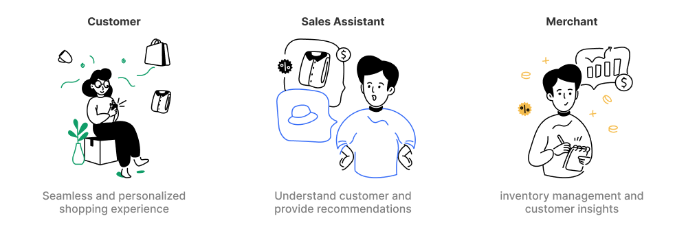
Storeoscope tracks what shoppers do and how they behave while browsing and buying. This helps merchants understand what customers like and want, so they can offer better products and services. It also helps merchants know how much stock they need and when to order more. By looking at past sales and trends, Storeoscope helps them keep the right amount of products in stock without running out or having too much.
Storeoscope provides sales assistants with insights into customer preferences and purchase history. This helps sales assistants offer personalized recommendations and provide better assistance to customers, leading to higher customer satisfaction and increased sales.
By showing customers products they're interested in and offering personalized recommendations, Storeoscope enhances the overall shopping experience both online and in store.
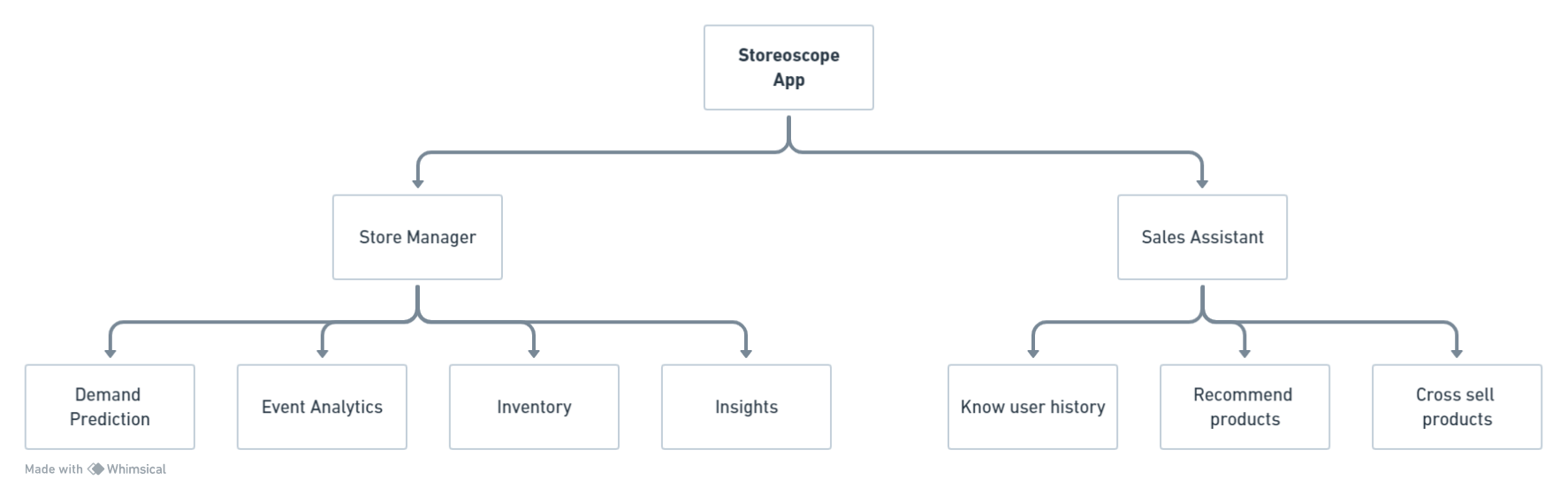
I decided to split the app into two parts
I decided not to cover the onboarding and empty state flows for the project as I was under a time crunch and also because it seemed pretty standard. I wanted to showcase my skills in terms of product thinking and motion design.
The first thing I did once I got my hands on the project was to put together a mood board, with a collection of pictures to generally get my head in the right thinking space. Once I did that, all the branding elements came naturally.
To fit with the theme of retail and analytics, I chose green as the primary color, as it represents shopping, money, and uptrend. The secondary colors are shades of black to keep the UI neutral.

I wanted the main focus of the product to be on customer satisfaction, so I decided to go with a smiley face, made from two of the Os in Storeoscope. I also used an arrow for the mouth to indicate an uptrend.
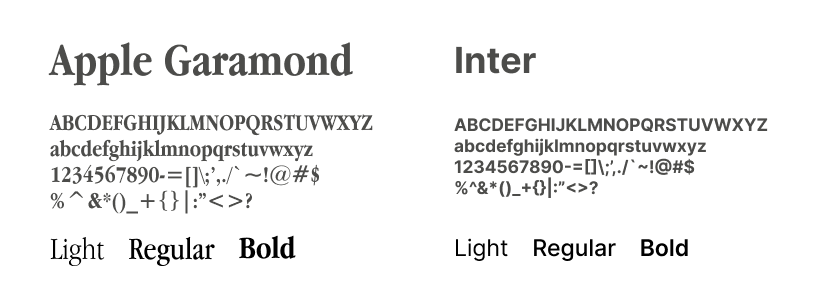
I used Apple Garamond as the header font, and Inter as the body font.
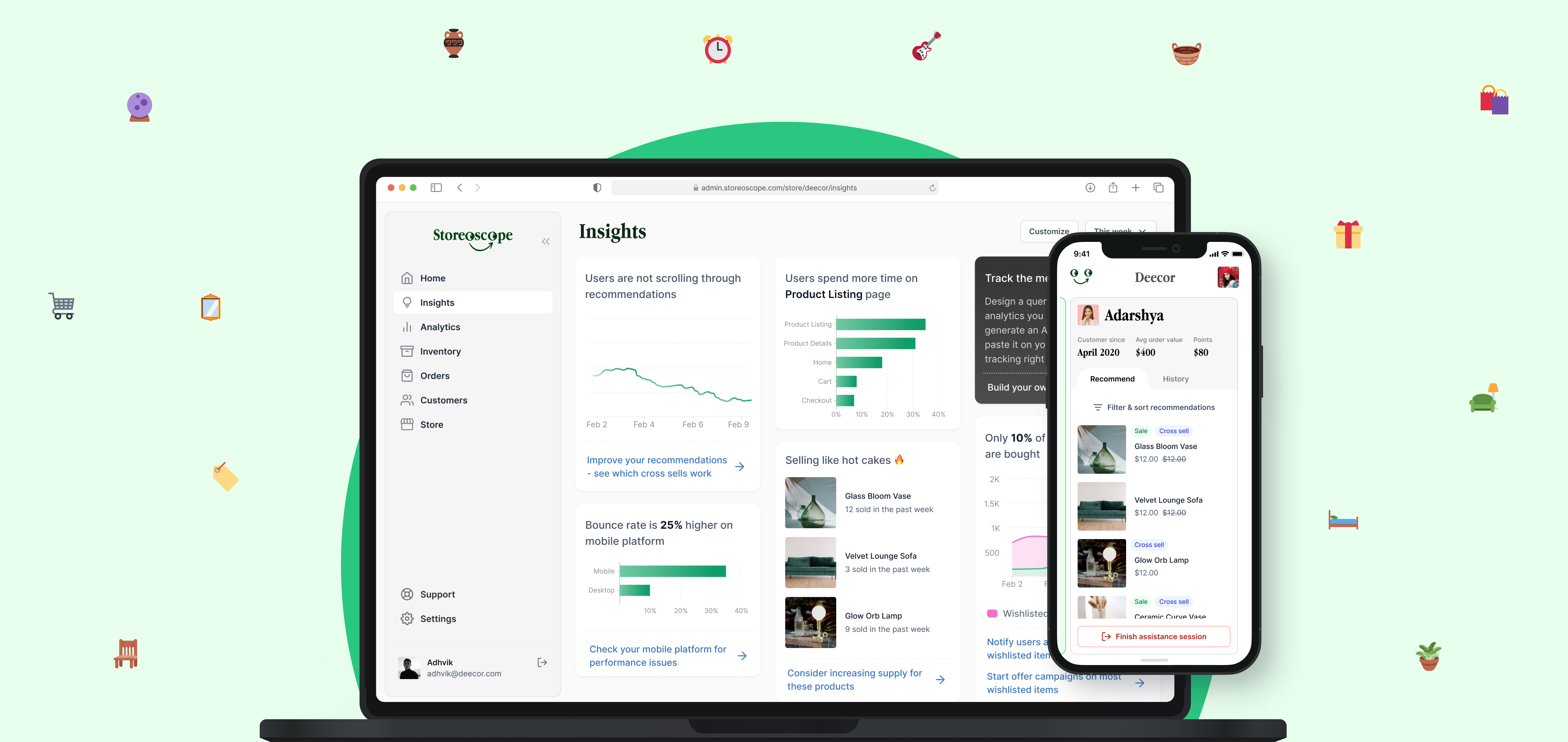
I designed the store manager end of the app in desktop layout as most likely they would be doing their inventory management or analytics tracking on a bigger screen. They would also have a mobile version ideally, but I have not designed for it.
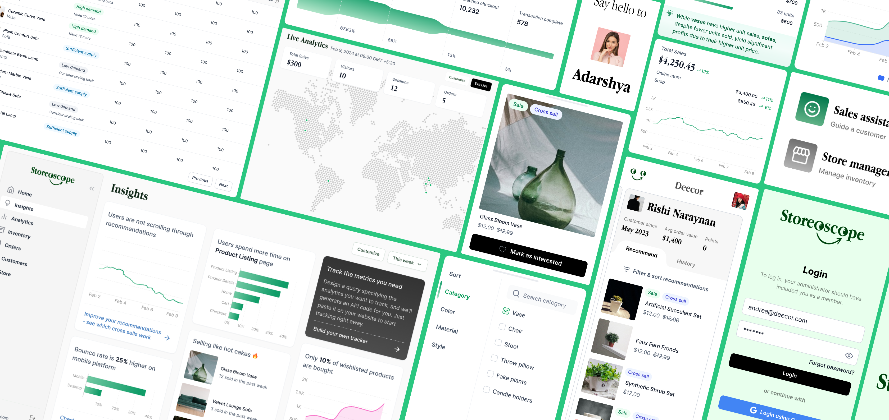
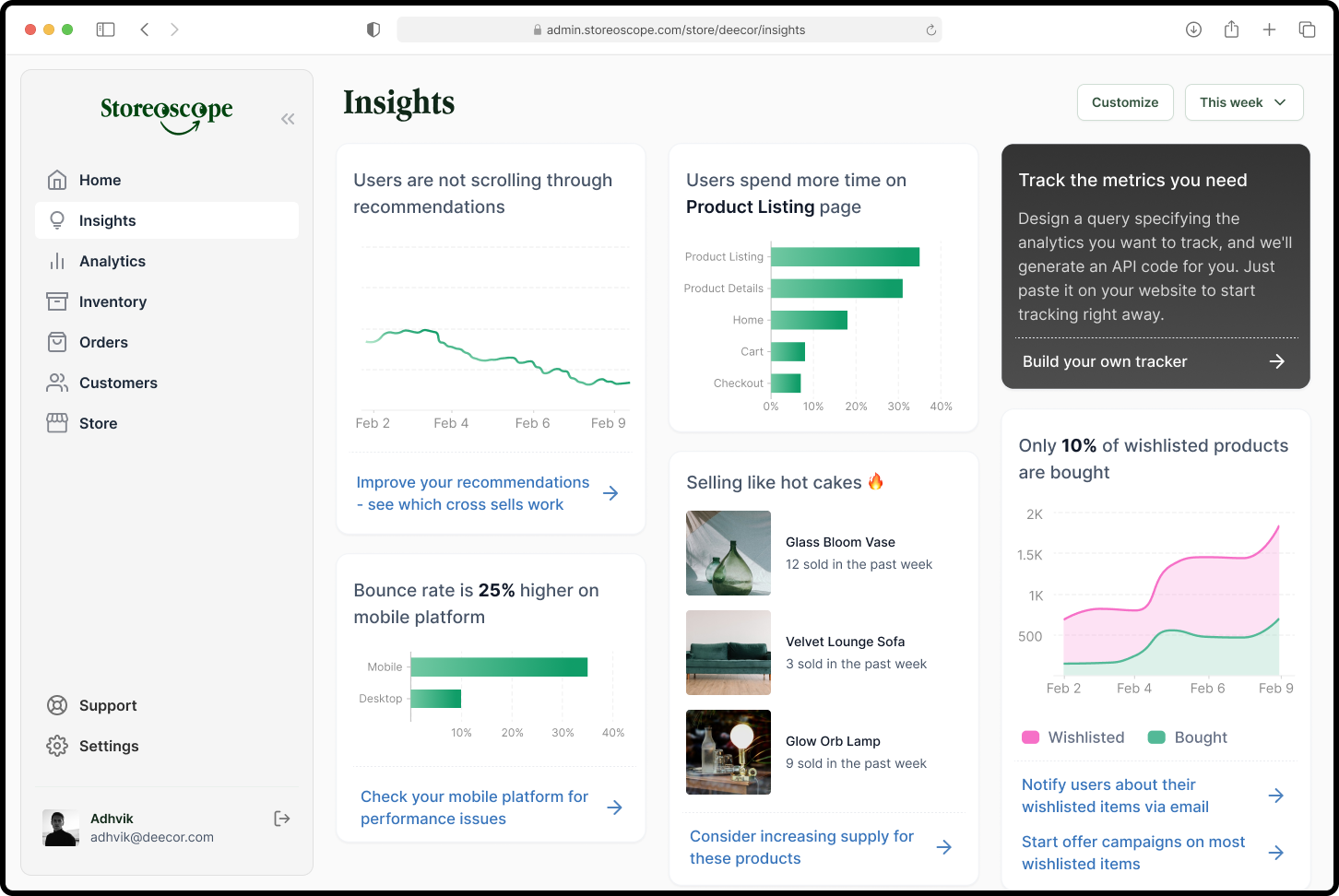
The insights page of the app would have analytics along with actions that the user can take. The user can also write their own queries to track the metrics they want from their website.
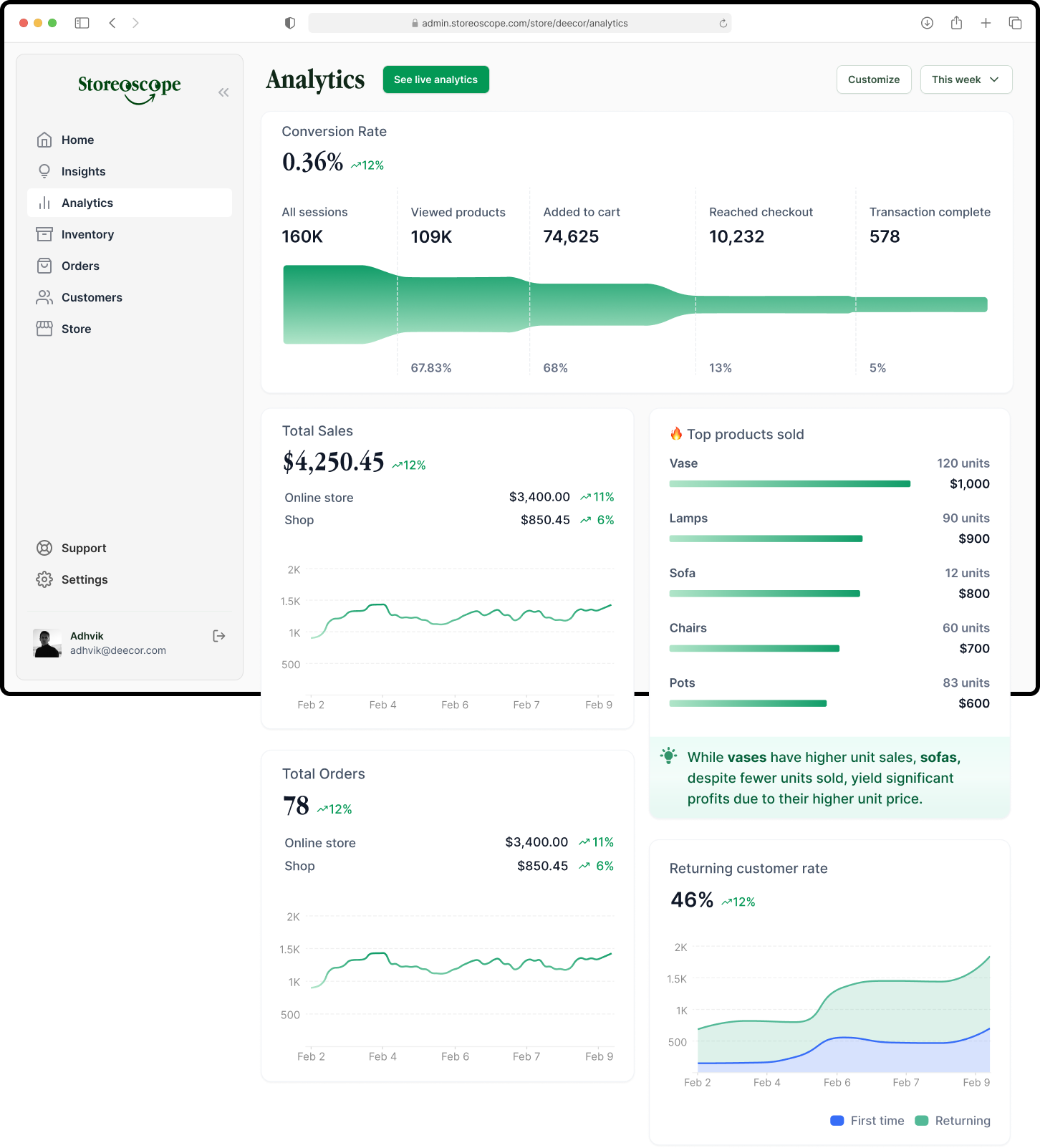
The analytics page would have metrics related to user activity. The user customize this page by adding more charts and also changing the timeline for which the data is displayed.
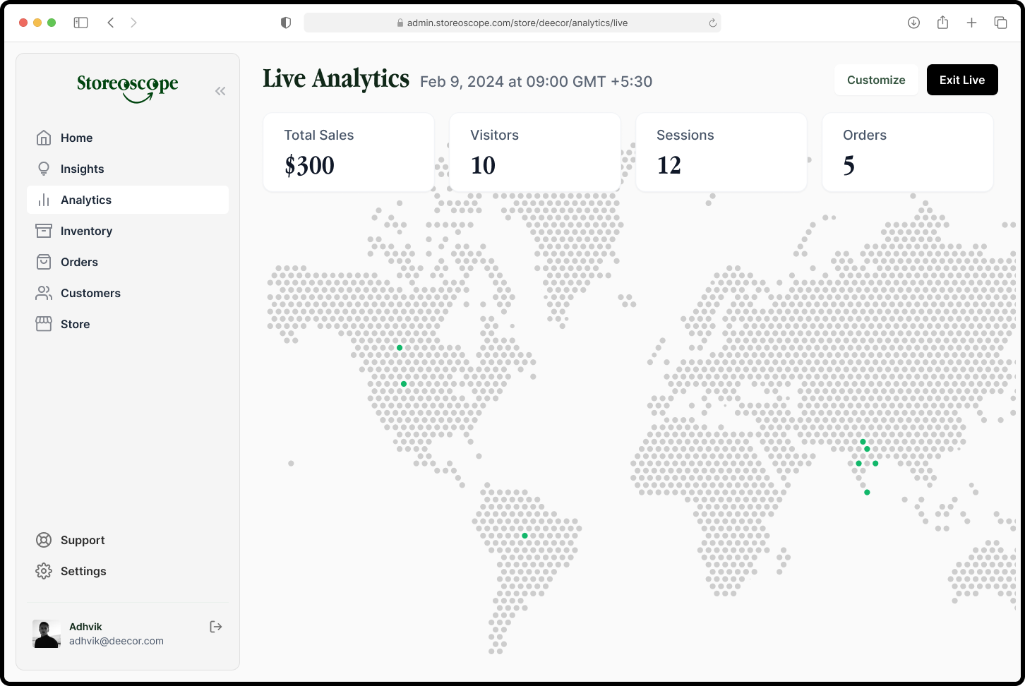
The analytics page would also have a live view where the user can see live metrics.
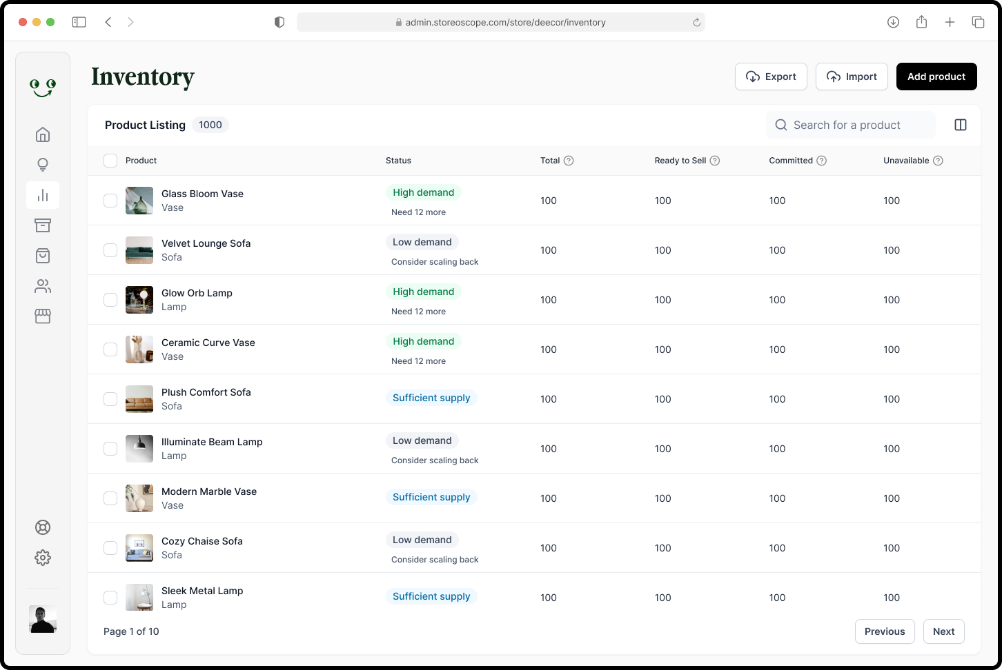
The inventory page would show all the product currently in stock, with a column dedicated to demand prediction. There are 4 values for any product: total, ready to sell, committed, and unavailable.
The side bar is collapsible - this increases work space
I designed the sales assistant side of the app in a mobile format as that is most likely their platform of usage.
Storoscope does not have a 'sign up' screen. This friction is added purposefully so that only the admin / store manager can add staff to their store. They would they have access and can login. After logging in, the user receives a friendly greeting. This can change according to the time of login.

Depending on their role, a user can have access to the store manager inventory, or the sales assistant app, or both. We also provide user assurance that they can later change the role they have selected by clicking on their profile.

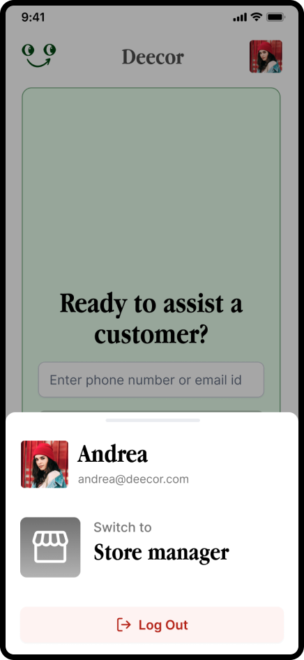
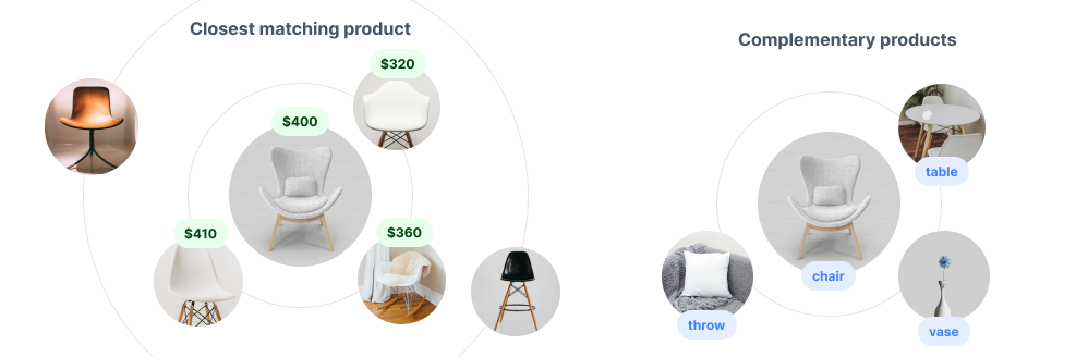
To assist a customer, the user enters their phone number or email id. The assistant then gets access to recommendation, and purchase history of the user.
.gif)
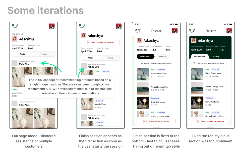
Sales assistant can also assist multiple customers at a time. This is possible through using a card layout rather than a full page layout.
%20.gif)
The card snaps to screen when user scrolls horizontally, instead of a free-form scroll.
.gif)
If sales assistant notices that customer is interested in a product, they can mark it as ‘interested’. This input would be recorded and later the customer might get the same product in their recommendations.
.gif)
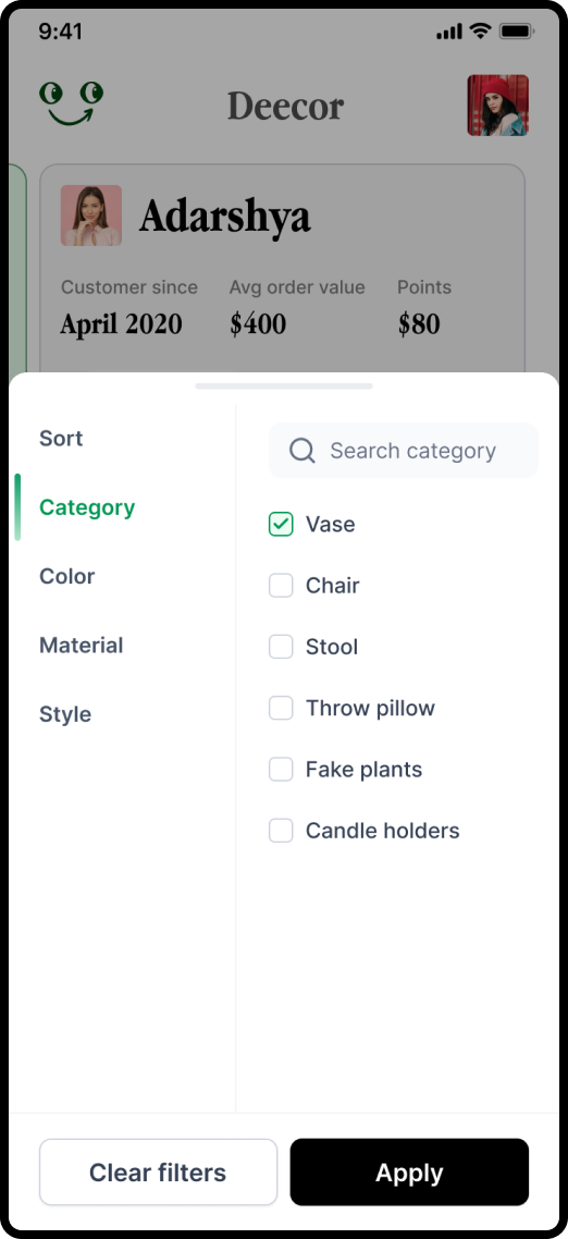
To get more precise recommendations, sales assistant can talk to the customer to understand their needs and filter the products they want.
Even though it was just a concept for a design assignment and won't actually be developed, I learned a ton along the way. Designing for both online and offline experiences, mobile and desktop simultaneously was a cool challenge. I tried many new things, from different tab styles and prioritizing motion design.