As a screening test for their summer internship program, the team at Razorpay put forth a design challenge. Candidates had to design the UI for a scheduling and subscription feature for the Indian food delivery app Swiggy, to create weekly and monthly subscriptions. Created user persona and prototypes. I iterated on different UIs and customer user journeys to find a lean solution for better integration into the app's existing information architecture and design system.
Swiggy is India's largest online food ordering and delivery platform. Apart from food delivery, Swiggy also provides on-demand grocery deliveries under the name Instamart and an instant package delivery service called Swiggy Genie.
I followed a five step framework that I thought best suited a beginner like me:
A lot of people depend on food delivery services for their meals. During an open ended research it was revealed that a lot of regular users feel that while there are a lot of options for them to order from there is a disconnect between when they have time on hand and when they actually want food. The product team wants to solve for this disconnect by building a feature to schedule orders and extend it to create weekly and monthly subscriptions.
Food delivery usually takes 40-50 mins during peak hours when restaurants have the most orders. Not to mention the traffic that prevails in metropolitan cities. Assuming the average lunch break is an hour in most places, the user has to place the order such that it gets delivered at lunchtime (say placing the order 30 minutes before lunch). If the person is busy with some work and forgets to place the order, they have to wait during the lunch break which falls into the peak hours.
Giving people the privilege of scheduling the food when they have time on their hands will not only help them plan their day comfortably but also motivate exploring restaurants at one's leisure.
Swiggy previously tried tackling this problem using 'Swiggy Scheduled':
" With Swiggy Scheduled, users can now place their orders in slots of 30 minutes, a minimum of two hours and maximum of 48 hours in advance. The firm has not added any charges for this pre-ordering service. In case of cancellation, the users can do so on the app itself, any time before the order becomes live. "
To find out how this problem actually impacts users, I interviewed a few people to gain more insight:
I created a persona, whose shoes I can put myself in to better empathize. Here, Navya is a Software Engineer who works through the day and forgets to order food within her lunch break. This leads to her either skipping meals, or choosing dishes that have least delivery time that she wouldn't have chosen otherwise.


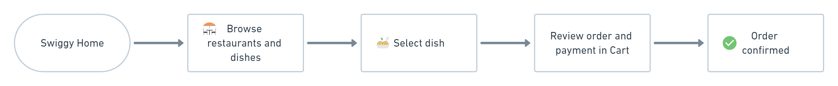
The current user flow of ordering in the Swiggy app is as follows:
When I started designing the solution, I had a very narrow vision. I only considered how the user would schedule the orders. My first iteration flow only added one extra step to the existing flow, that is to allow users to schedule their deliver in the Cart.

But I soon realized this posed a number of problems. Say, Navya wants to order her favorite dish, a Mexican shawarma from Zaitoon. As she's about to confirm her order in the cart page, she notices the scheduling option. She decides to give it a whirl, seeing as she orders the dish almost once every week. But as soon as she selects the date and time, the app lets her know that the dish is only available from 6pm everyday. She has no way of checking out dishes available at 6pm either.
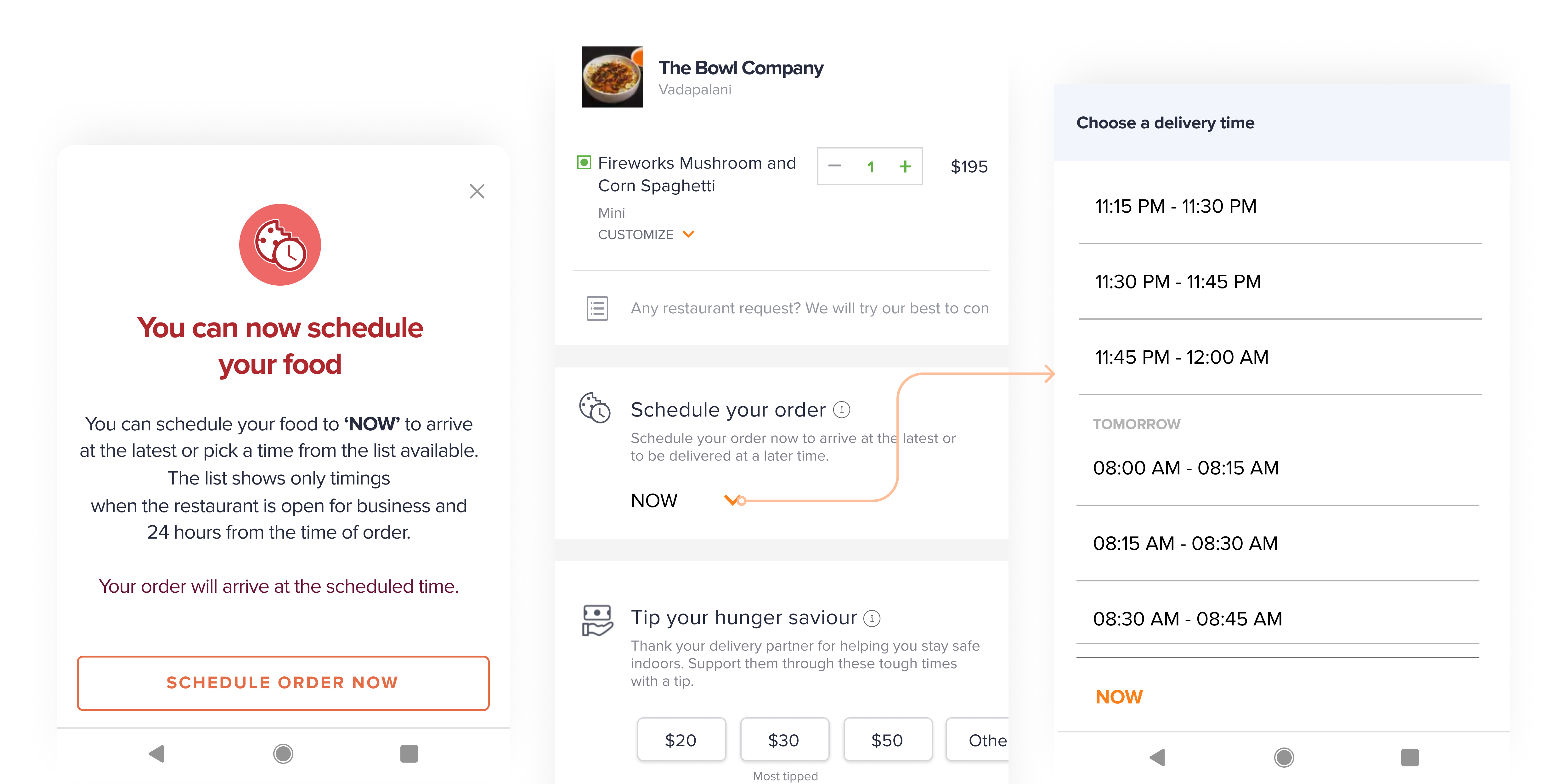
Discovery of the scheduling feature was a major issue, as users would only find the feature when they reach the cart. This seems counterproductive as no one would decide to schedule food when they want to order food for now.
The menu the user browses will only show items available at that point in time. There is no way for user to know which restaurants and dishes are available at the time the user schedules the food.
Item and restaurant unavailability might occur when user selects date and time of delivery, at which point they might feel disappointed that an error has occurred. This might be worse if user decides to subscribe to a dish for multiple days.
So this warranted for one major change that affected the whole flow.
Getting the time and date of delivery upfront from the user.
After considering the edge cases, I came up with the following flow:
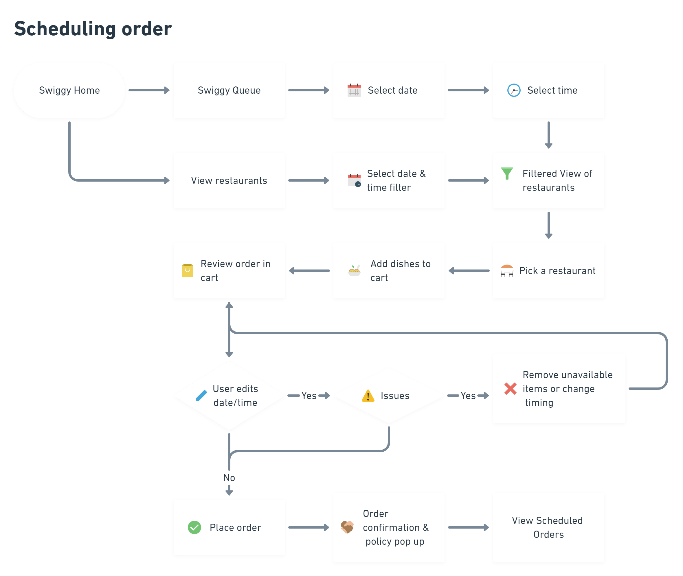
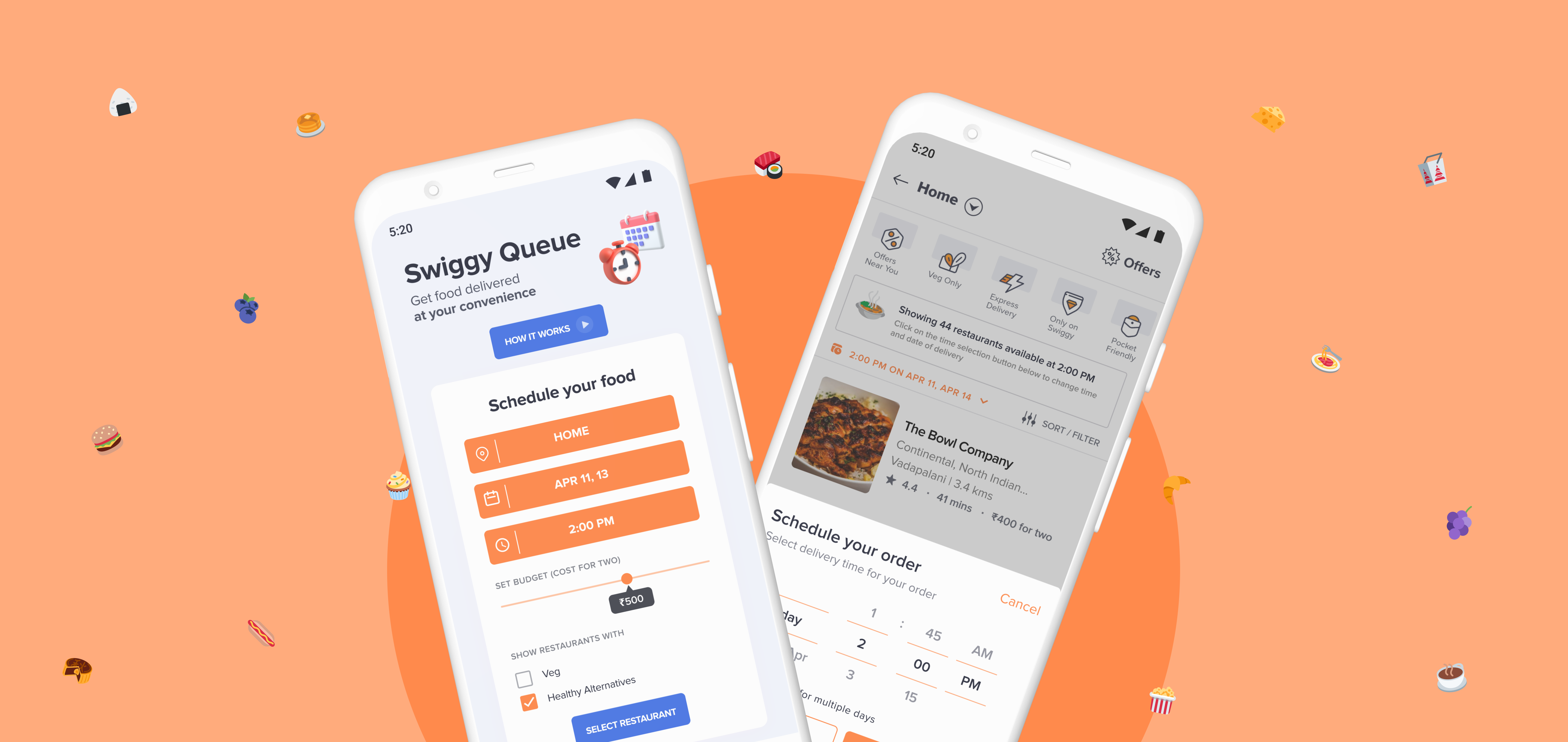
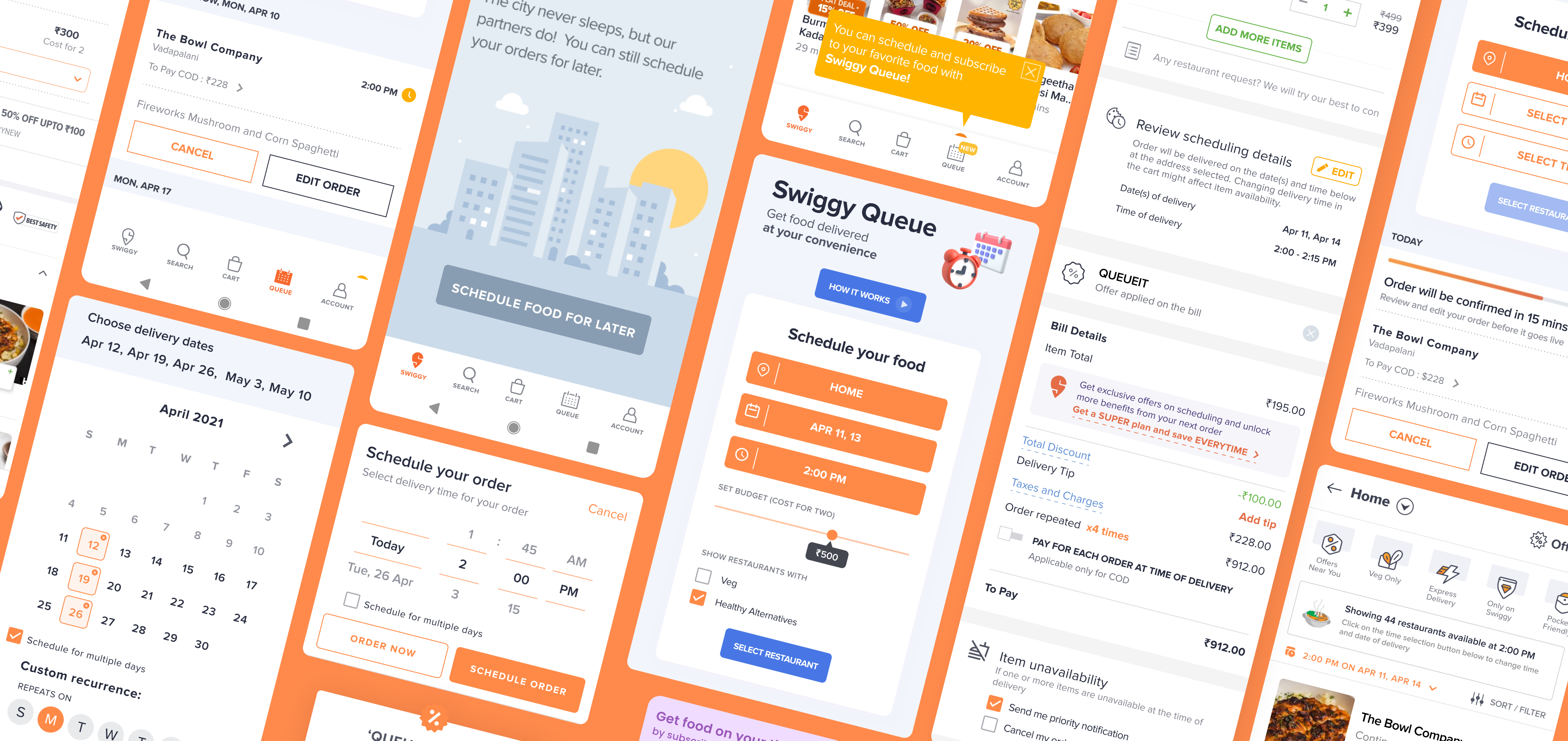
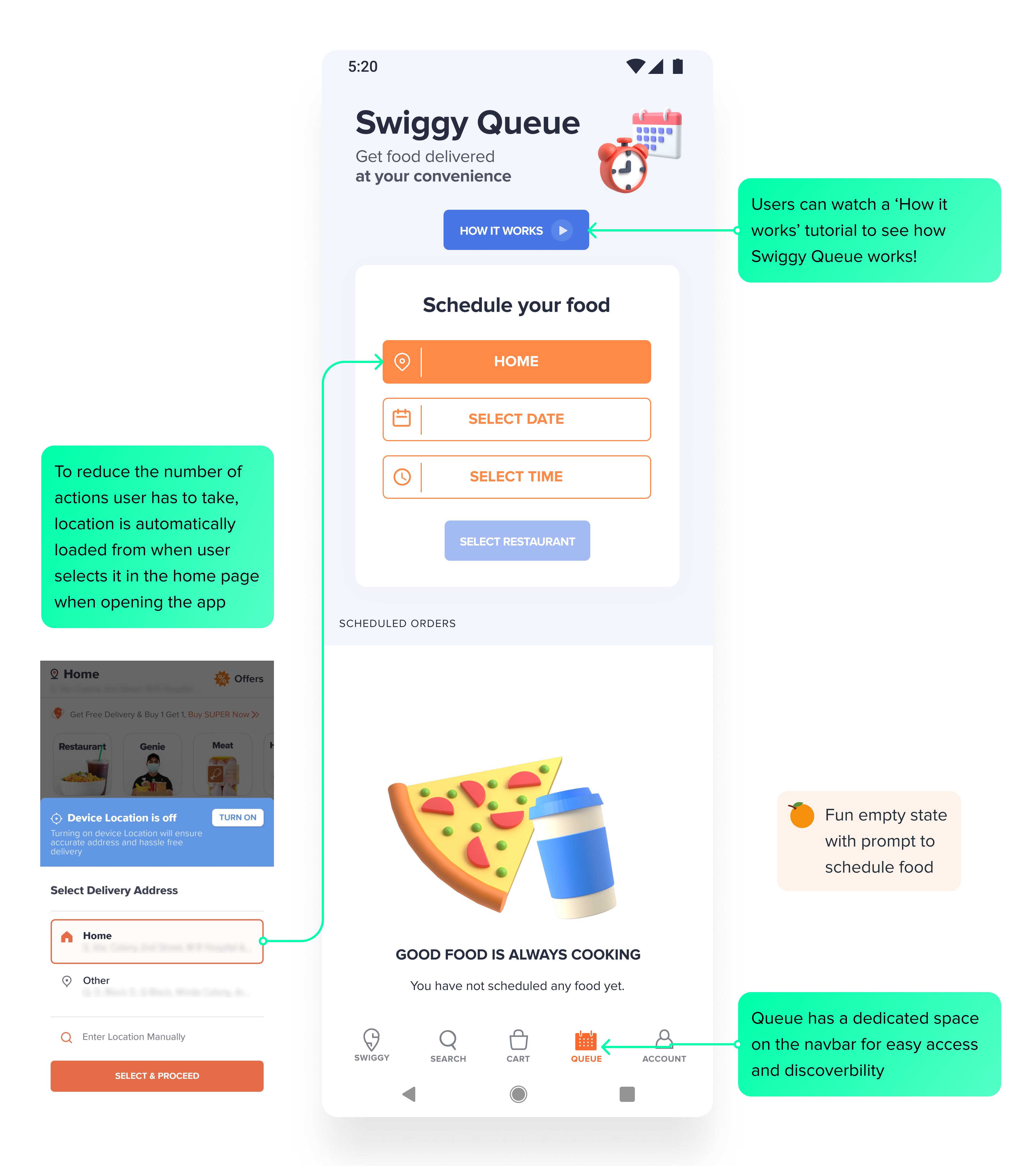
I decided to provide the feature, which I named 'Swiggy Queue', a separate position on the existing Information Architecture to improve discoverability. It can be accessed through the main navbar. Modelling after Swiggy's package delivery feature Genie, I created the UI for Swiggy Queue.
🧠 To reduce the number of inputs the user has to give, the location is automatically filled in from when the user logs into the app.
I used a calendar icon for the navbar icon, and also used a clock and calendar illustration to convey the use of Swiggy Queue better.
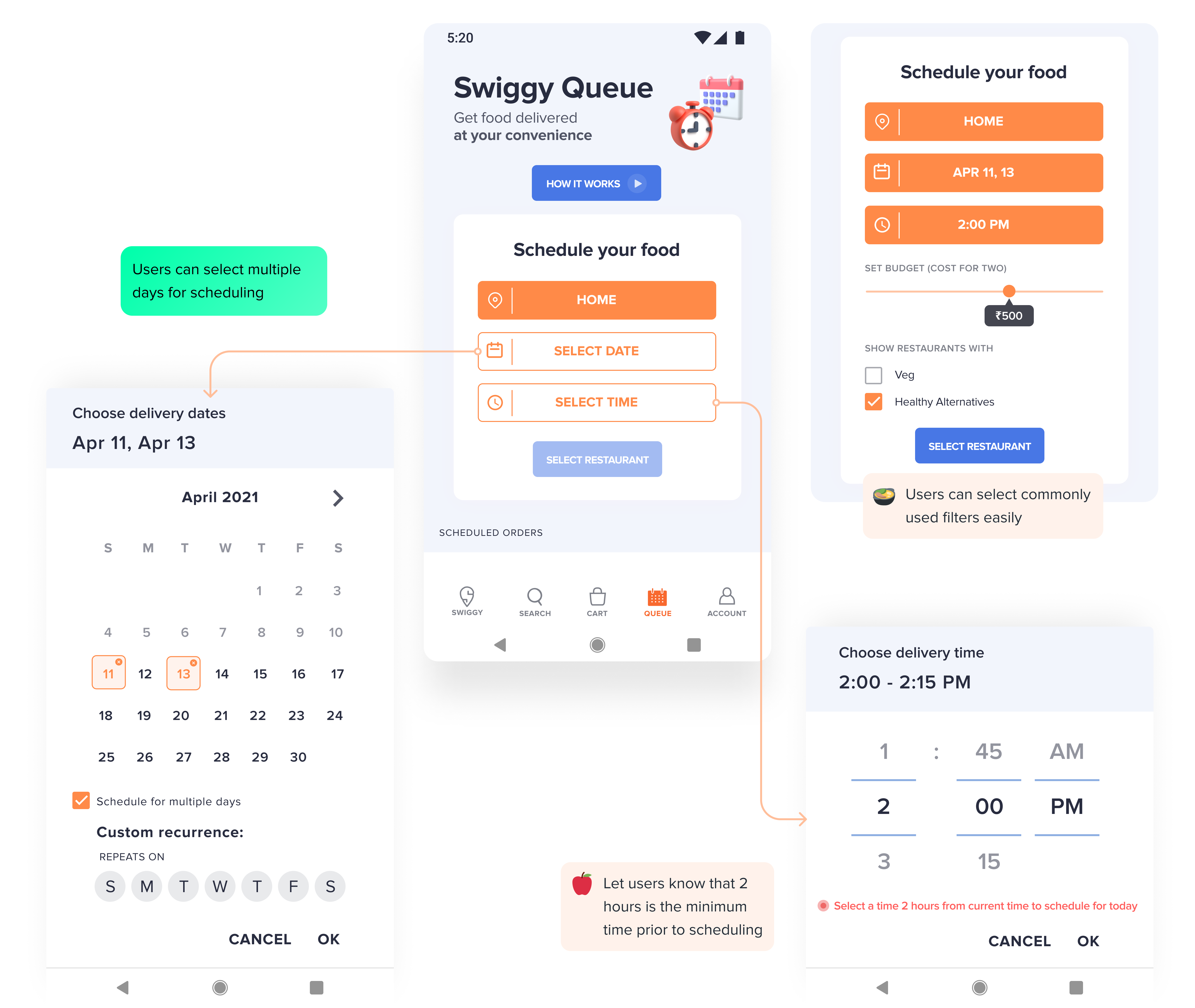
Users can select a single or multiple days for delivery. I also added a constraint that users cannot schedule orders less than 2 hours from that point in time.
🧐 The UI indicates that there is 15 minute buffer period in the selected time of delivery, so as to give users a realistic timeframe
After user selects the location, date, and time, a few commonly applied filters show up for the user to access. Navya can now easily apply filters she needs.
Navya can now browse through a selection of restaurants and dishes that are available at the chose date(s) and time. She can also easily choose to order normally by clicking 'Order Now'.
😊 Giving users the option to change their decision at any point in the flow increases flexibility
The cart section is by far the most detailed section of the design.
Firstly, users can review and edit their scheduling in the cart page. But, we let them know that doing so might result in some items being unavailable at the chosen time. ( Editing in the cart page will be discussed soon. )
Another angle I addressed this is through the coupons. I created a coupon called 'QUEUEIT', modelled after 'SWIGGYIT'. It is automatically applied on scheduled orders. Now Navya can save more on her regularly ordered dish by scheduling it!
💡 This incentivizes users to schedule meals regularly and brings in regular orders for the restaurants also
Thirdly, the payment method can be chosen by the user. By choosing to pay upfront for all the orders, Navya can avoid paying by cash on every delivery.
Fourthly, users can choose what happens when some items are unavailable in their order at the time of preparation. By choosing 'Send priority notification', users can be informed on such a case where either the restaurant is closed for delivery or item is out-of-stock/removed from the menu. ( Notifications will be discussed soon. )
Finally, on confirmation of order users are notified that they can manage their orders in the Swiggy Queue section.
After ordering, Navya can view and edit her orders easily. She can add those extra pickles for that day's order alone. The orders scheduled are indicated by a yellow clock icon.
If the order has any issues, such as the item being unavailable or restaurant being closed due to unforseen circumstances, the order is marked with a red exclamation and is brought to the users attention.
Navya has already paid for her order though. In that case, she will be refunded for that order. She can also choose the cancel the subscription if she wishes.

As I said before, if users choose to change the location, date, and time of delivery of scheduled orders in the cart page, it might lead to some unavailability issues, either the dish not being available at the given time, and/or restaurant not delivering at the selected time or location.
If Navya does change the time of delivery of her shawarma, she can easily reset her changes to when it was available before.
🥰 By allowing users to undo their actions, we promote experimentation and engagement
Users can choose priority notifications to be informed about their scheduled orders on the day of delivery, 30 minutes before confirmation. They will also be notified incase of item unavailability or any delays. A numbered bubble also appears on the Queue icon in the navbar.
Here, Navya can see a countdown timer on her notification screen for when the order will be confirmed. She can choose to edit the order before confirmation.
The main issue with my initial iteration was that the feature had very low discoverability. So for my third iteration, I prioritised it.
I started my journey in UI/UX design in January of 2021. I decided to learn by doing and this was my first ever design project. Working within an existing design system took away lot of the complications and design decisions that would've otherwise presented. Working with a clearly defined problem statement also reduced the workload of research and pain point discovery.
The process seemed very straightforward and linear to me at first. But after my first iteration, I realized design is cyclical and iterative, no where near as linear as I thought. I constantly went back to previous phases of the process to question my designs and come up with better solutions.