A take-home design assignment: Design for Fina, a personal finance app that lets users connect bank accounts, track spending, set savings goals, and monitor investments in one place. The brief: design an AI-powered Financial Snapshot that gives users a personalised, plain-language summary of where they stand financially and what to pay attention to right now.
Most people who struggle with money aren't struggling because they lack information. They're struggling because of behaviour — avoidance, impulse, anxiety. They open the app reactively when something feels off. Let's look at two examples:
Priya buys something 🛍️ → UPI notification → dismisses it → tells herself she'll check later → later never comes → anxiety builds quietly.
Priya opens app feeling unsettled 😥 → goes to transactions → scrolls raw data → checks spending chart → can't tell if it's a problem → no answer, no action.
The brief asked for a financial snapshot: a plain-language summary of overall financial health. But Priya either doesn't arrive at all or arrives asking "am I running over my means?". A generic summary doesn't help her.
There's a behaviour buried in the brief that changes everything. Most users open the app reactively. So, how do we meet users in the moment of feeling that uncertainity, rather than ask them to come find us?
That reframe changed everything: from a pull feature that lives inside the app, to a system that reaches out at the right moment, with the right context, before the anxiety has time to build.
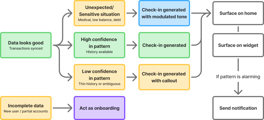
The system needs to treat these differently:
🏠 Never flag committed spend as overspending.
Telling someone their rent is high is meaningless.
🛍️ Only behavioural spend gets a budget conversation.
🏦 Intentional spend is always framed as positive.
₹5,000 transferred to a savings goal is not money leaving, it's money working.
At the start of the month, salary has just landed. The balance looks healthy and the psychological state is relief. The user isn't anxious yet.
Mid-month is the reactive zone - spending has accumulated, budgets are getting close, and this is when Priya opens the app because something feels off.
By the end of the month, the mindset splits: surplus or recalibration. Either there's money left over and a decision to make, or the month didn't go to plan and the question is why.
But it's not really about the calendar date. It's about where the user is in their own salary cycle. That's the mental ledger most people are running in their heads. A user paid on the 18th has no meaningful relationship with the 1st to 31st view their app is showing them.
A savings-first user watches their account balance go down. A credit card user watches it stay the same all month, and then gets hit with a bill. The anxiety doesn't build gradually. It arrives all at once when the statement drops. This changes what the check-in needs to do.
For a credit card user, the account balance is almost meaningless until payday. What's already on the card and how much they can safely add are the numbers that matter.
1. Users have at least one bank account connected and enough transaction history to say something meaningful. No history, no snapshot.
2. The Account Aggregator pipeline is reasonably fresh. Stale data dressed up as a live insight is worse than no insight.
3. Spending categories are already being inferred with decent accuracy. The AI summary is only as good as the categorisation underneath it.
4. The AI narrates, does not advise. This is a product decision and a regulatory one.
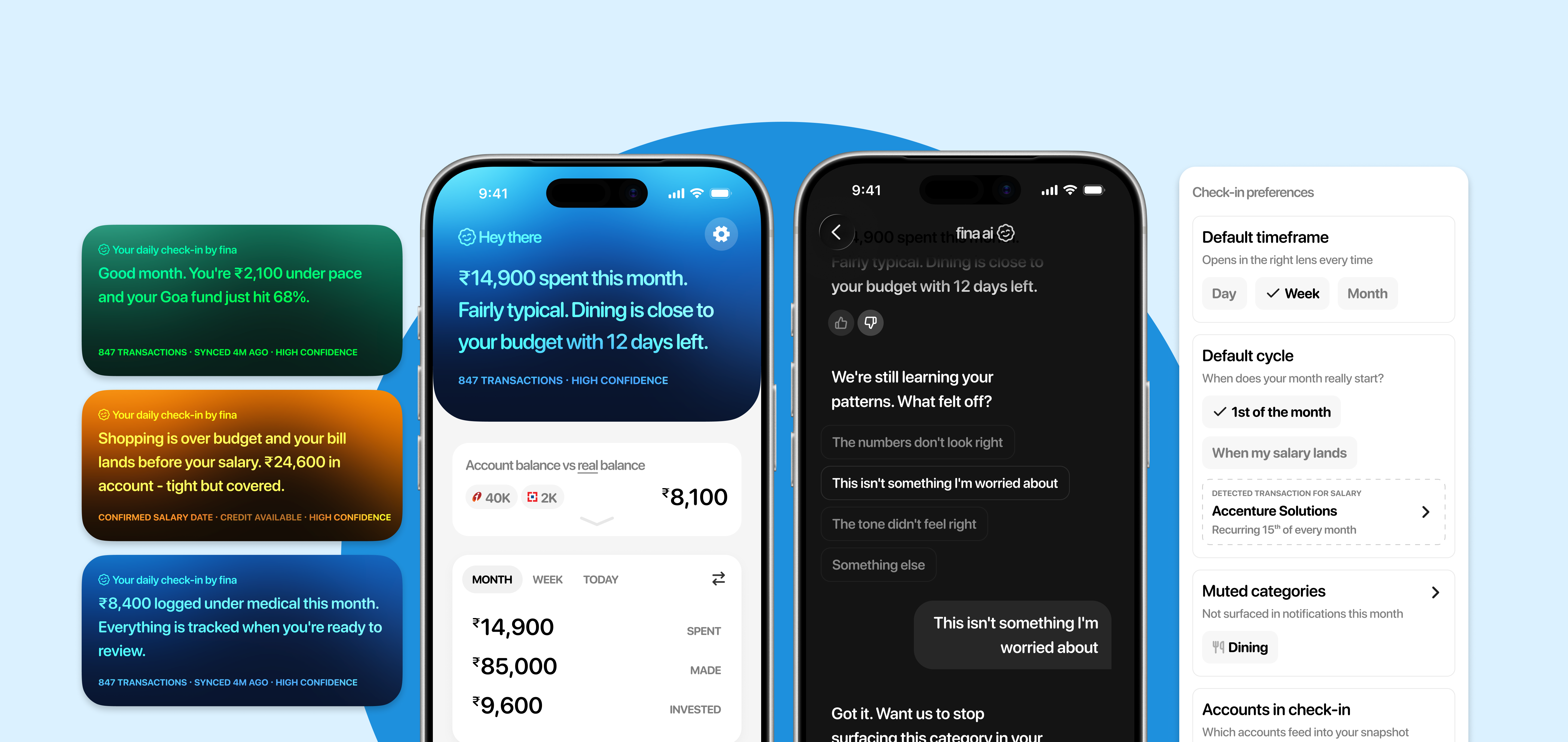
Check-in ✅ a daily snapshot of how your finances are doing. It isn't a single screen. It's a three-surface system, each doing a distinct job.
🏠 Snapshot on home — contextual deep dive. Surfaces automatically when the user opens the app, can speak with Fina AI to learn more.
📱 Widget — ambient awareness. A glance tells you if things are calm or need attention. No interaction required.
🔔 Notification — event-driven push. Sent when a meaningful threshold is crossed. Names what happened in plain language.
This matters because push beats pull for reactive users. (Insight 1) A feature that only lives inside the app will mostly be ignored by the people who need it most.
The check-in refreshes once daily after the morning Account Aggregator sync. This is a deliberate product decision, not a technical shortcoming. The user can always hit a hard refresh within the app.
Real-time financial data is expensive infrastructure and Account Aggregator pulls are not instantaneous. A feature that promises live accuracy but delivers something slightly stale is worse than being upfront about the cadence.
👉 Users can calibrate to a daily snapshot. They cannot calibrate to something that feels live but isn't.
The right question isn't "why isn't this real-time?" It's "does the user need it to be real-time to get value?" For the reactive user checking in each morning, the answer is no.
👉 Low confidence due to thin data
New user, limited history, or connecting only a credit card account can result in low-confidence insights. Surface these with honest language. "This might be worth watching" is doing very different work to "you are overspending."
👉 User marks check-in as wrong repeatedly
The check-in pulls back its confidence: "We're still learning your patterns." It doesn't go silent.
The AI will occasionally be wrong.
Every snapshot has a feedback mechanism. Mark as wrong, dismiss, recategorise.
Notification fatigue kills the system.
The AI makes a send or don't send judgement on every potential notification. Only meaningful threshold crossings qualify.
Sensitive activity like medical bills, low balances, missed payments.
Sensitive situations trigger a different register entirely. Neutral, factual, no nudges, no cheerfulness.
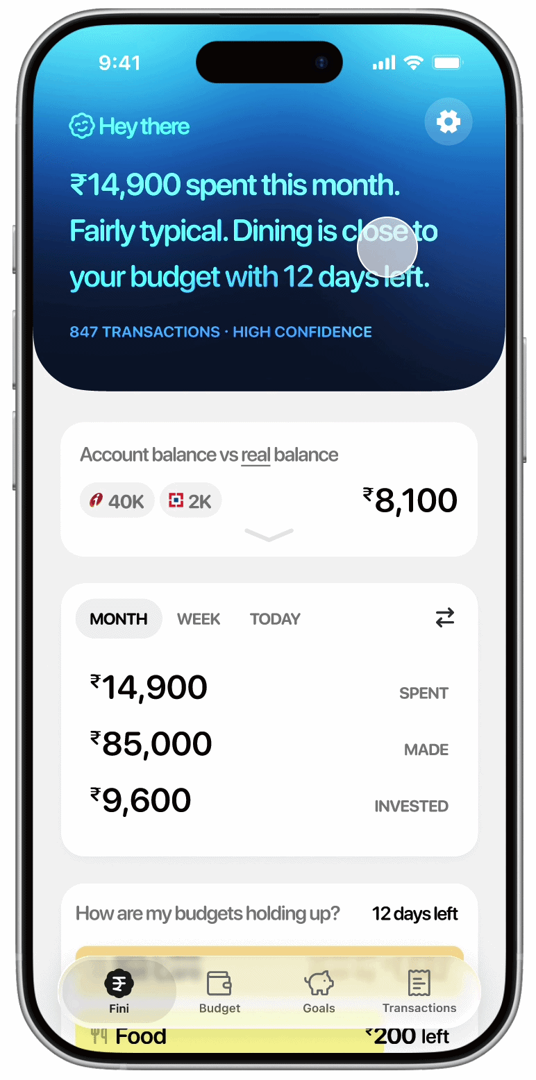
Every check-in is short. The source, confidence, and last sync sit below in a smaller line. The source line is specific, not "based on your data" but the actual accounts and inputs used.
The check-in card shifts from cool blue when things are calm to warm amber when attention is needed. The user doesn't need to read a single word to know whether something needs their eye.
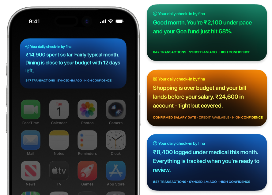
The at-risk copy names the specific tension - bill before salary - not just "you're overspending." The sensitive activity (mitigation 3) drops all nudges. The check-in never mentions committed spend (insight 2) as something to worry about - if rent went out this month, it's not in the headline.
Through the month, the copy shifts (insight 3):
Early month: "Salary landed. ₹20,800 left after committed spend and goals."
Mid-month: "₹14,900 spent so far. Dining at 95% with 12 days left."
End of month: "Good month. ₹2,100 under pace and a ₹11,200 surplus to allocate."
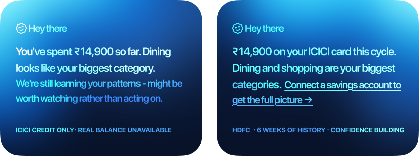
When data is thin, the language shifts to match. A new user with 6 weeks of history still gets a useful check-in, but framed honestly: "this might be worth watching rather than acting on."
A user who has only connected a credit card sees spending by category and safe to add but the check-in names what it can't see: "Connect a savings account to see your real balance."
Clicking on the check-in snapshot lets you converse with Fina AI about it. You can provide feedback on the check-in (mitigation 1): mark as wrong, dismiss, flag as irrelevant. Every correction feeds back into the system.
The check-in starts working immediately using 6 months of transaction history. What Fina already knows, it shows. What it needs confirmed, it asks through the chat: salary, rent, subscriptions, one confirmation card at a time.

One thumbs down is feedback. Three in a row means Fina isn't calibrated for this user yet. The check-in still shows the data but owns the uncertainty on what's been flagged: "you've flagged this before, let us know if we're reading it wrong."
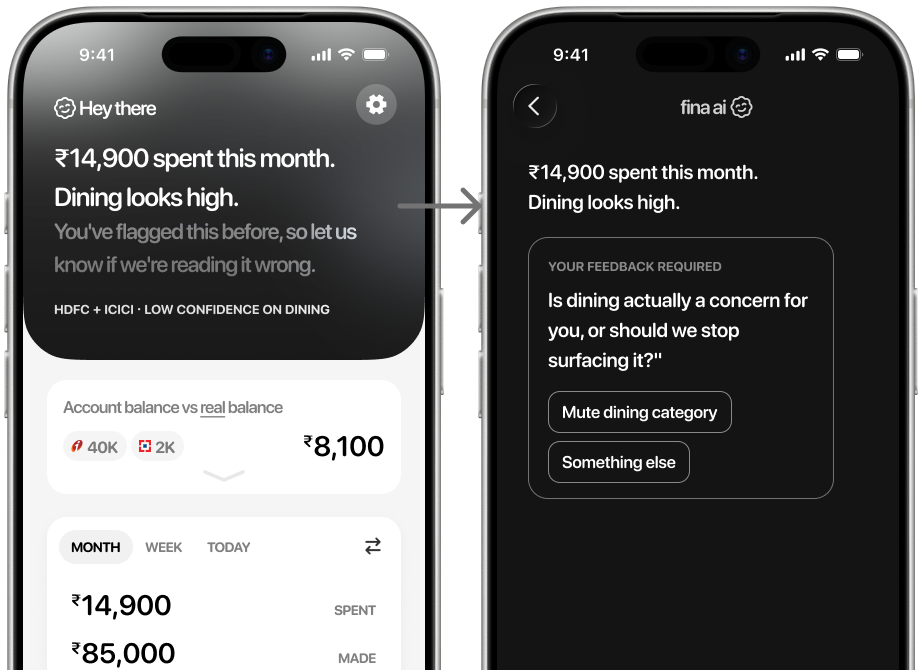
The gradient shifts to neutral grey. No emotional signal until Fina earns the right to one. One tap opens the chat. Fina asks one specific question and adjusts. The next check-in reflects it.
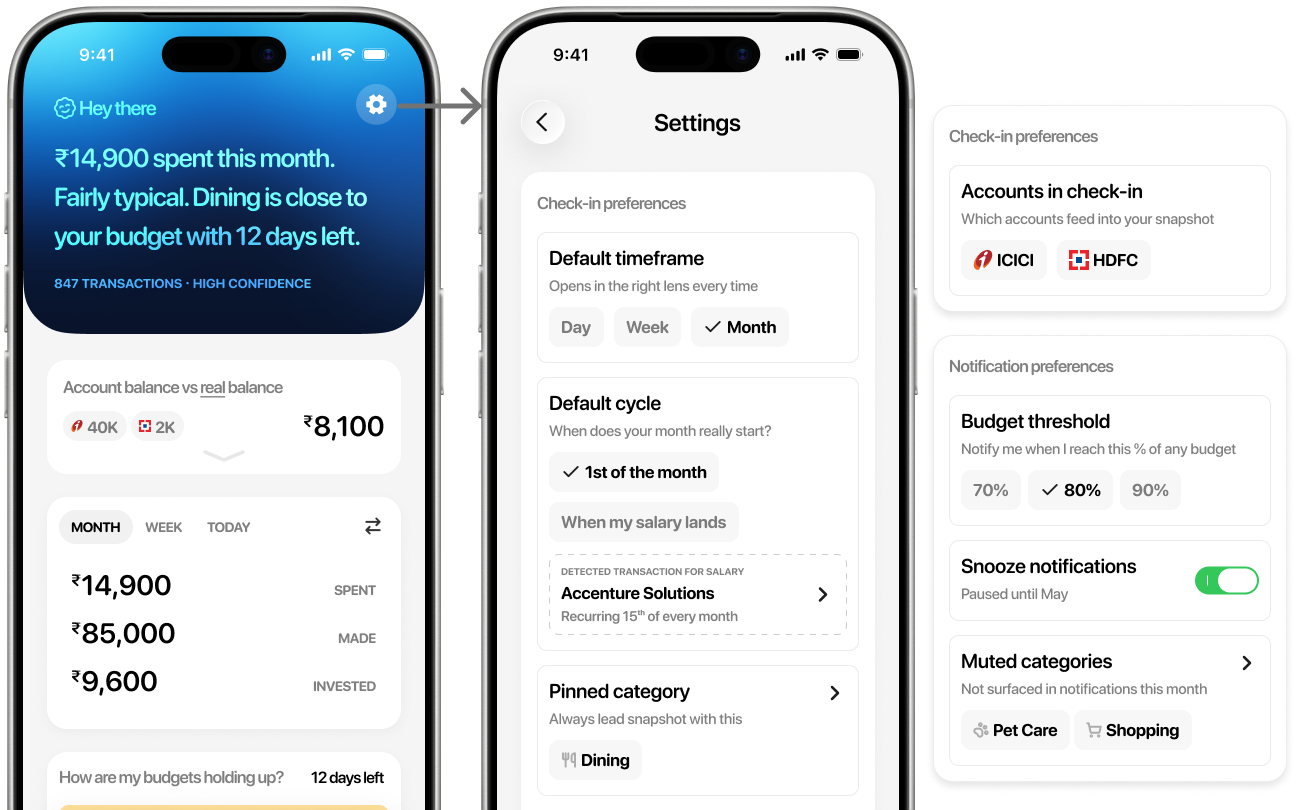
You also have controls to pin a category to always lead the snapshot with, set default timeframe and include/exclude which connected accounts feed into the check-in. Set default cycle, whether your month resets on the 1st or when your salary lands (insight 2). Most finance apps assume the 1st. Fini works around your actual cycle. Notification preferences (mitigation 2) like set your own tolerance for budget notifs, snooze, or mute a category.
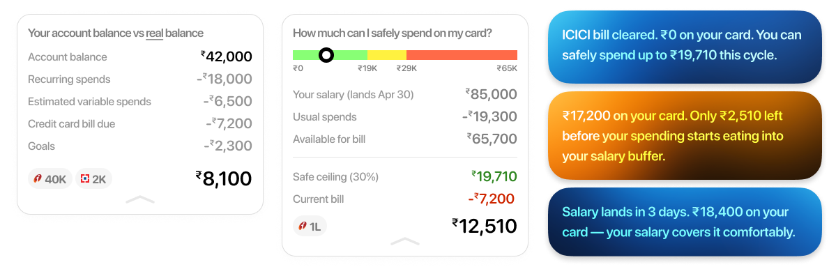
Account balance vs real balance: Most finance apps show account balance. But rent is due, the credit card bill is coming, subscriptions are renewing. The real balance subtracts all of that. That's the number that tells you what you actually have.
The credit card user is a distinct type (insight 4): For a credit card user mid-cycle, the account balance is irrelevant. What matters is the current bill, whether salary covers it, and how much more they can safely spend.
Before: Priya buys something 🛍️ → UPI notification → dismisses it → tells herself she'll check later → later never comes → anxiety builds quietly.
After: Priya buys something 🛍️ → next morning sync picks it up → ✅ check-in reflects the purchase
Before: Priya opens app feeling unsettled 😥 → goes to transactions → scrolls raw data → hecks spending chart → can't tell if it's a problem → no answer, no action.
After: Priya is feeling unsettled → ✅ check-in on her widget / notification / right on top of the app → 🔍 she drills down or leaves with clarity.
MVP: Start with the snapshot on the home screen. Nothing else. No notifications, no widget. Just: does a user who opens the app reactively get their answer faster than they did before?
Phase 2: Introduce notifications - sent once a day after the morning sync, only if a meaningful threshold has been crossed. Not real-time, not per-transaction.
Phase 3: Introduce widget - Ambient awareness for users who are already engaged enough to want a passive signal on their home screen. Built on the same daily refresh.